
Company rebranding step by step. When it makes sense and how to keep what customers already know
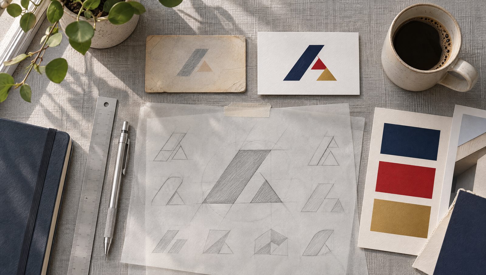
Rebranding means changing how a company looks and presents itself, from a light refresh of the logo to a new name, logo and identity system. It is worth doing when the way a company looks no longer fits what the company is today. Good rebranding keeps what customers recognise and tidies up the rest.
The most common mistake is starting with the logo. Before the first sketch, you need to know what stays, who the brand is talking to and where it will be used.
When does rebranding make sense?
Rebranding is not a reward for an anniversary. It makes sense when the current look gets in the way of sales or growth. These are the signals we see most often among clients in manufacturing, transport and services.
- The legal form or name has changed. Mardo had been a limited company (sp. z o.o.) since 2016, yet until 2024 it still signed off with a logo carrying the suffix “s.c.”, which denotes a civil partnership.
- The company has outgrown its look. Kadrol trades with global groups such as Cargill, yet online it appeared as “Kad-Rol Przedsiębiorstwo Rolne” (Kad-Rol Agricultural Enterprise), set in black lettering with no symbol.
- New services or brands have been added. Fraszek started in electrical work and grew into photovoltaics, air conditioning, automation and a training centre, while operating under several names at once.
- The company is going international. The name and logo have to work in another language and next to international competitors.
- The logo does not work on screen. Thin lines and small lettering disappear in an avatar, on an invoice or in the navigation on a phone.
Refresh or a new logo?
A refresh updates a logo people already know. A new logo is a change from the ground up. The choice depends on how much recognition the company has already built and whether the current logo can be saved.
| Logo refresh | New logo | |
|---|---|---|
| When | the logo is recognisable but looks dated or works badly at small sizes | there is practically no logo, or it is associated with something the company is moving away from |
| What stays | symbol, colours, layout | usually the name |
| Risk | low, customers recognise the brand straight away | associations have to be rebuilt |
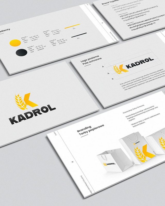
| Example | Mardo kept its red and navy and gained dynamic wings | Kadrol went from lettering alone to a logo with an ear of grain shaped into the letter K |
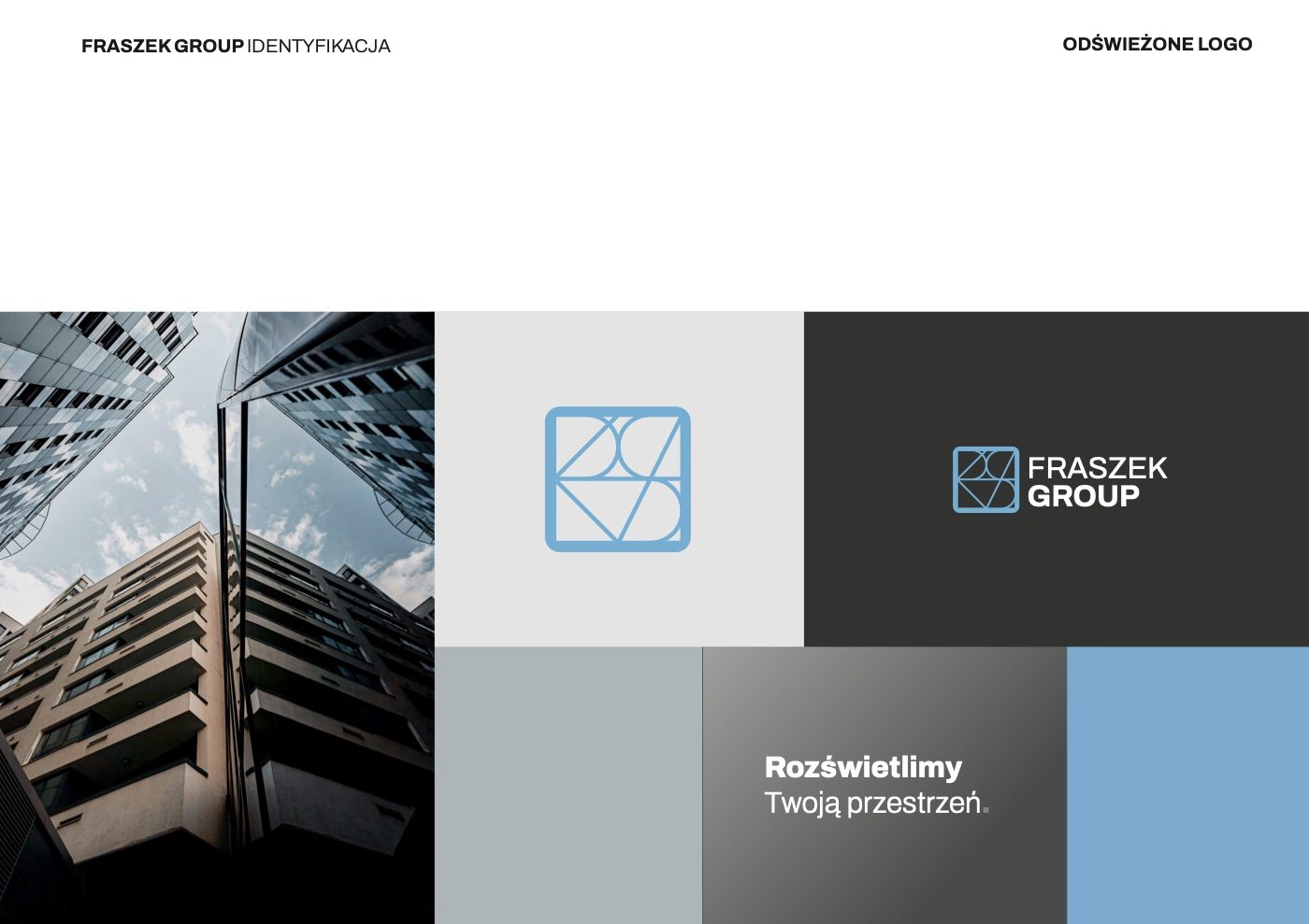
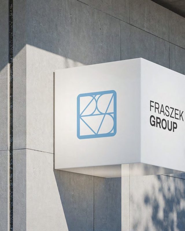
For Fraszek Group we did a refresh. We kept the recognisable symbol and the colour arrangement, and the long “Grupa Usługowa Fraszek” (Fraszek Services Group) became a short FRASZEK GROUP. The logo got a heavier line and a single typeface, so it reads well on a business card and on a building facade.
Rebranding step by step
The order of the steps matters more than how many there are. Each stage builds on the decisions made in the one before.
- Audit what exists. Logo, names in use, website, vehicles, signs, printed materials. We list where the brand lives today and what customers actually recognise.
- Workshop with the team. With Fraszek Group we started by describing the brand in three words, a SWOT analysis and three personas (an engineer from industry, a homeowner making renovation decisions and a buyer at a wholesaler).
- Competitor research. In the electrical trade most logos look the same, with a hard hat, a cable and a 24h emergency service. That was a chance to stand out.
- Decide what stays. Name, colour, symbol. This is a business decision, not an aesthetic one.
- Design and real-world testing. We check the logo straight away on a vehicle, a bag, the website and an avatar, not just on a white background.
- Brand book. Construction rules, colours, typefaces and applications, written down so that the printer and every agency that comes later use the brand the same way.
- Rollout. A list of everything carrying the brand, with the order and deadlines for replacing each item.
Brand architecture, or what to do with several names
A company with several lines of business often has several names that appeared along the way. You have to decide whether everything goes under one brand, or whether a parent brand sits above separate service brands. Fraszek Group got a structure with a parent brand and two service brands, Cool Air and Instel, and we prepared four options for linking the logos to choose from.
Rollout. What should you replace first?
A new logo does not have to appear everywhere on the same day, but the order matters. Start with what customers see most often and what is easiest to change.
- Website, social media profiles, email signature and avatars.
- Documents, such as proposals, invoices, letterhead and business cards.
- Signage, such as vehicles, signs, the building facade and workwear.
- Packaging and product materials, once the old print run has been used up.
For Kadrol, the new logo went onto fertiliser bags, packaging and a website presenting its products, fleet and certificates. For Mardo, the rebrand completed the change of legal form, and the new website got an English version for clients abroad. See the identity work for Kadrol, Mardo and Fraszek Group.
If you are wondering whether your company needs a refresh or a new logo, get in touch. We start with an audit, and you will find the scope of our brand work on the services page.
Frequently asked questions
How long does a company rebrand take?
A logo refresh with a brand book usually takes a few weeks. A rebrand with a name change, a workshop, brand architecture and new signage takes longer, because it involves board decisions and production lead times for vehicle graphics, signs and packaging. The rollout, not the design, usually takes the most time.
Will rebranding hurt brand recognition?
Not if it keeps what customers already know. With a refresh, the symbol and colours stay, so regular customers recognise the brand straight away. The risk is higher with an entirely new logo, which is why it pays to replace it on all the main items within a short time.
What does rebranding include?
Usually an audit of the current brand, a workshop, competitor research, a new or refreshed logo, colours and typography, a brand book and designs for the key items, such as the website, documents, and vehicle and building signage. With several lines of business, brand architecture is added.
Should you refresh your logo or get a new one?
If customers recognise your logo and the problem is how it looks or how legible it is at small sizes, a refresh is enough. A new logo makes sense when there is practically no logo, when it is just lettering with no symbol, or when it is associated with something the company is moving away from.
Co-founder, art director. Designs visual identity systems for demanding clients, with the people who will use them in mind.