

Kadrol
From “Przedsiębiorstwo Kad-Rol” to a brand with an ear of grain shaped like the letter K
About the project
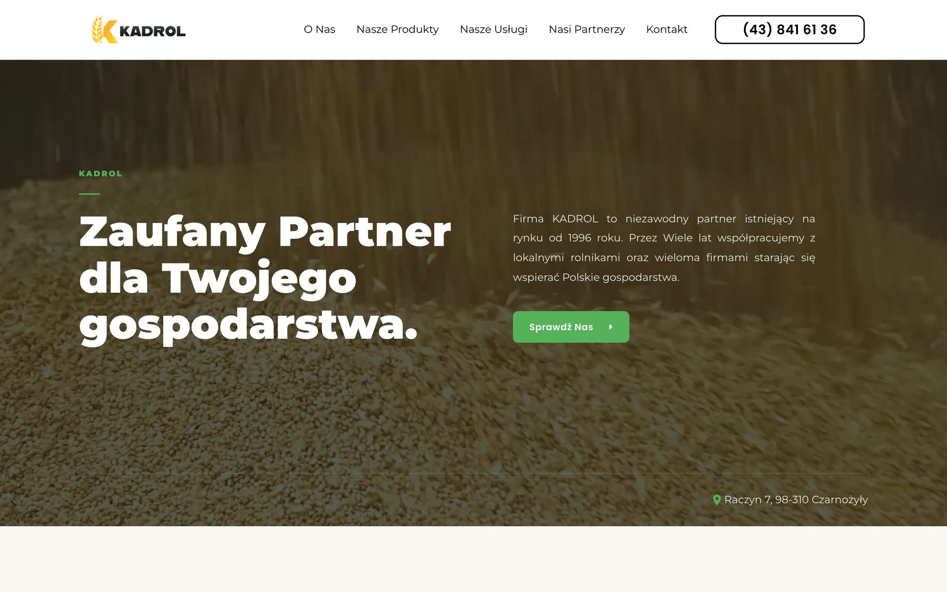
Since 1996 Kadrol has been buying grain from farmers around Wieluń and selling them fertiliser, and it trades with companies such as Cargill. It operated as “Przedsiębiorstwo Kad-Rol”, with an ear of grain and a cogwheel next to a long name. We did the rebrand and the brand book.
(Challenge)
The old brand was called “Przedsiębiorstwo Kad-Rol”, and its logo combined an orange ear of grain, a green cogwheel and black lettering in two sizes. A company working with international corporations looked like a local grain collection point.
01 / 03(Scope)
- The name merged into one word, KADROL
- A logo with an ear of grain shaped into the letter K, in vertical and horizontal versions and as a standalone symbol
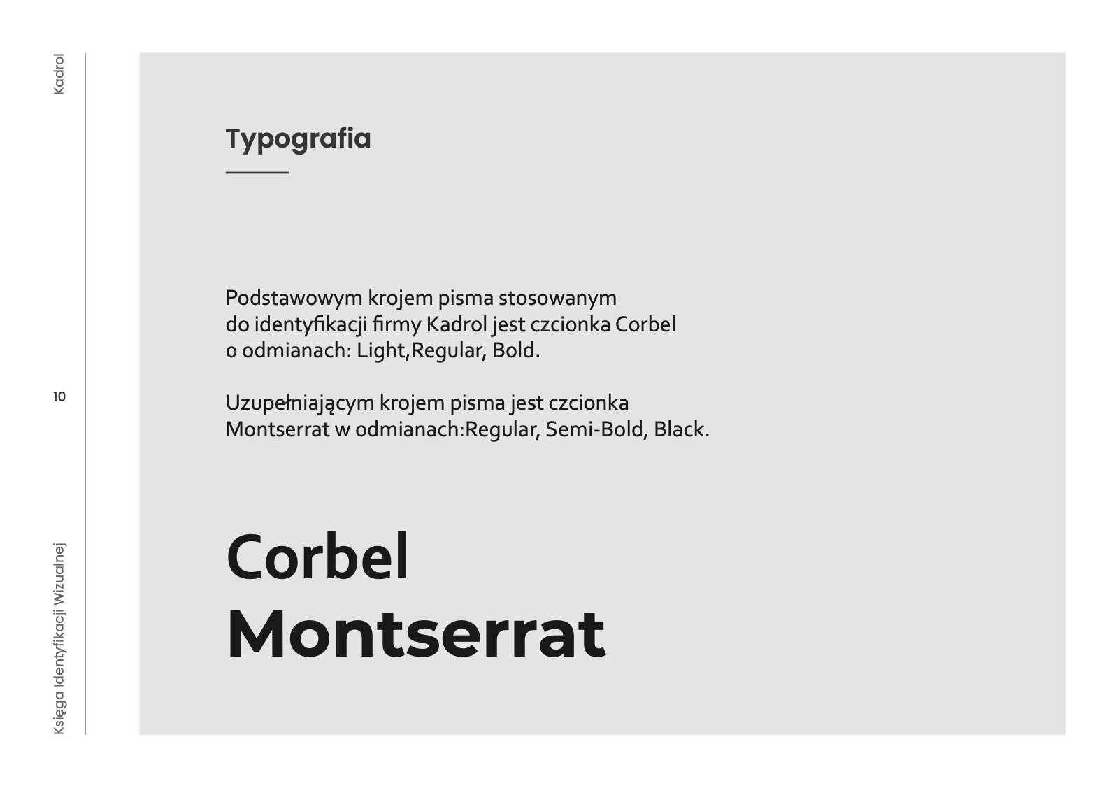
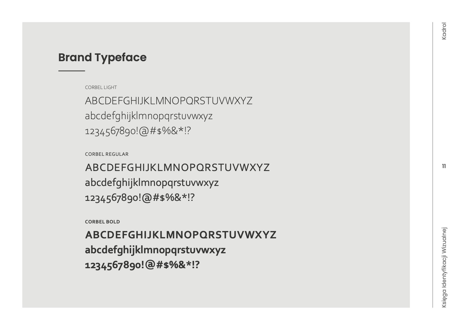
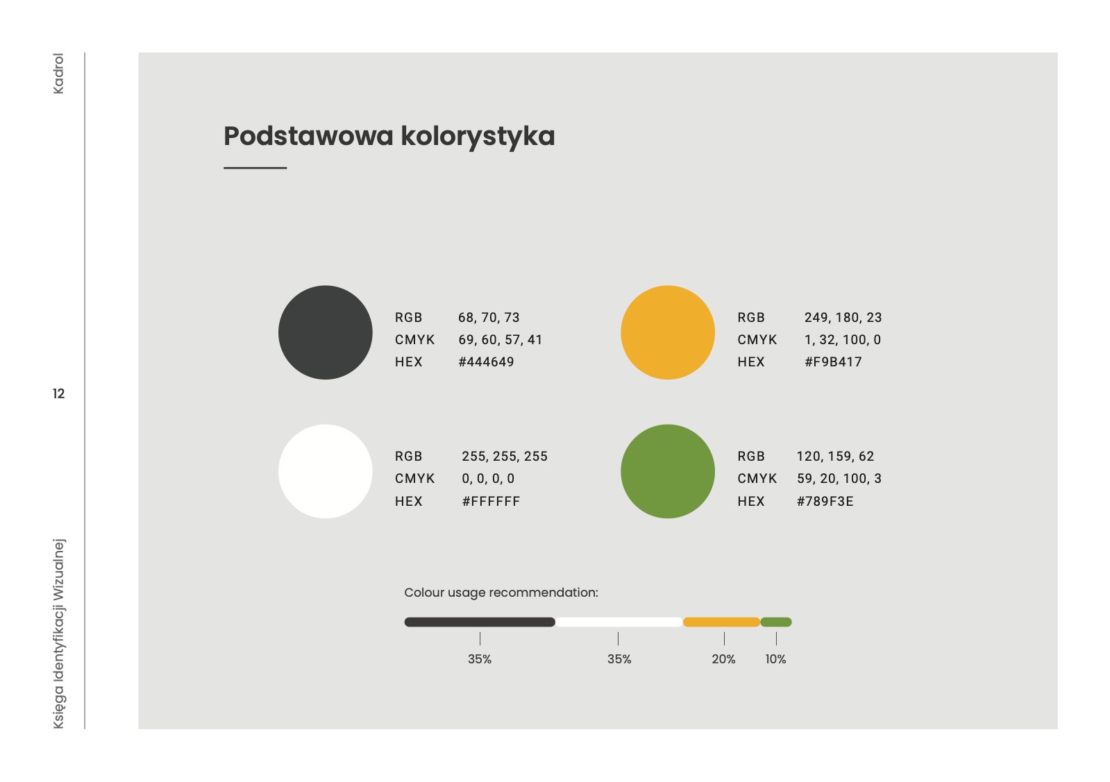
- Grain yellow, graphite and green, gradients, Corbel and Montserrat typefaces
- Visual identity guidelines
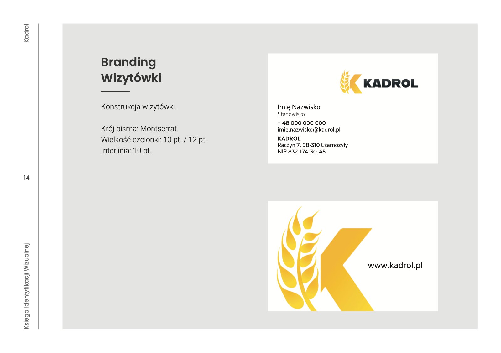
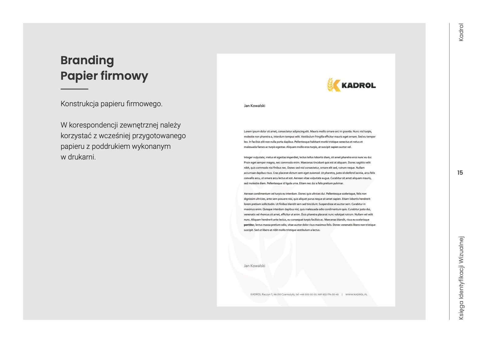
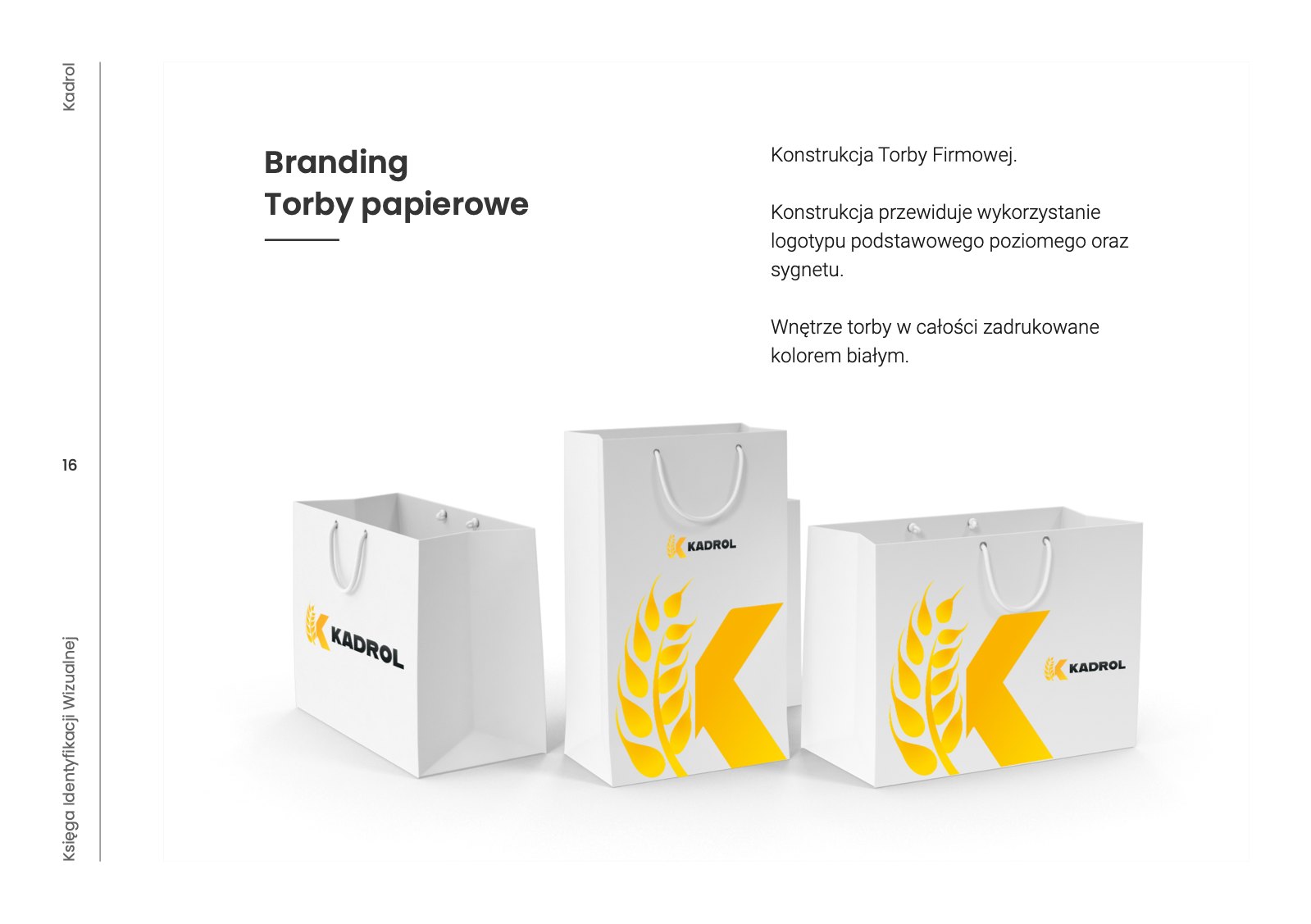
- Business cards, letterhead, paper bags and flags
(Result)
The ear-of-grain logo works on a fertiliser bag, on packaging and on screen, and the short KADROL replaced the three words of the old name.
03 / 03years in business
word in the name instead of three
logo versions, vertical, horizontal and symbol
Before
and after
Drag the slider. This is how the brand looked before it came to us, and how it looks today.
The mark
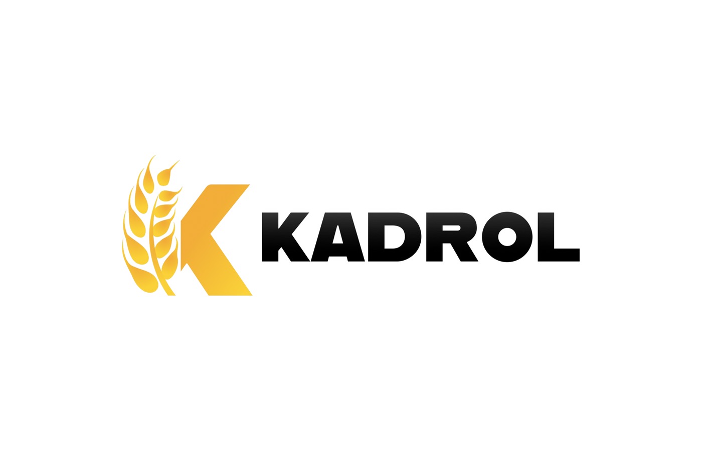
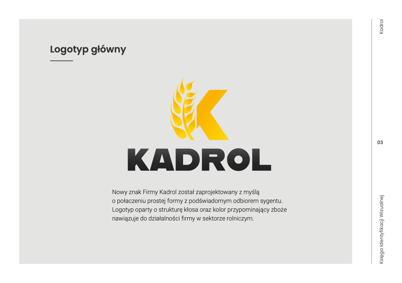
Before the rebrand, an orange ear of grain with a green cogwheel and the words “Przedsiębiorstwo Kad-Rol” beside it in two sizes. After the rebrand, a single word, KADROL, with the ear of grain and the letter K merged into one symbol in the yellow of ripe grain.
 BeforeAfter
Brand
book
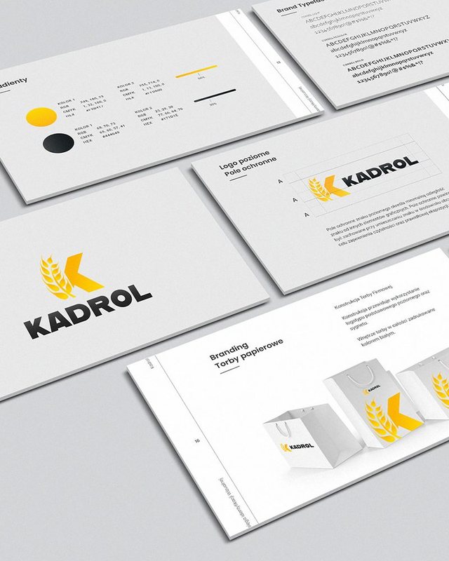
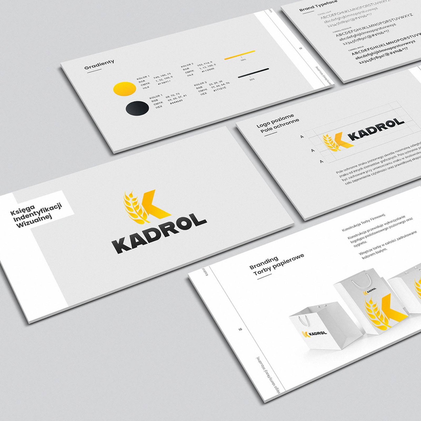
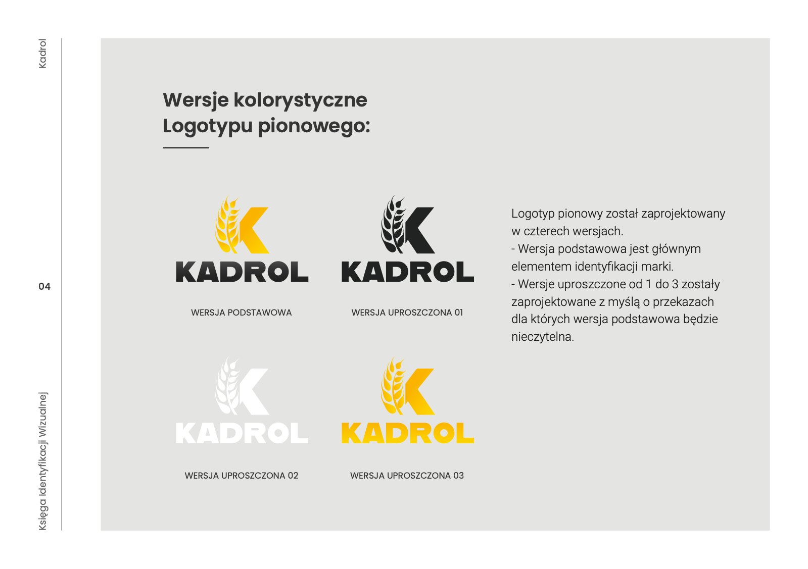
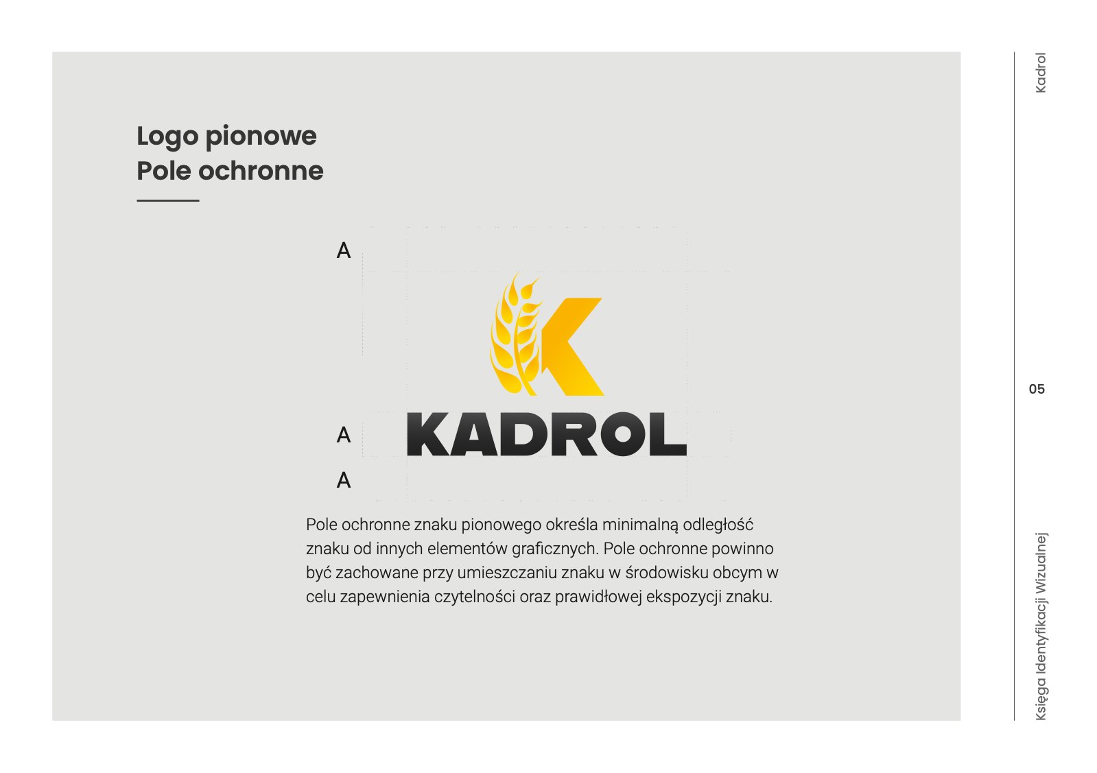
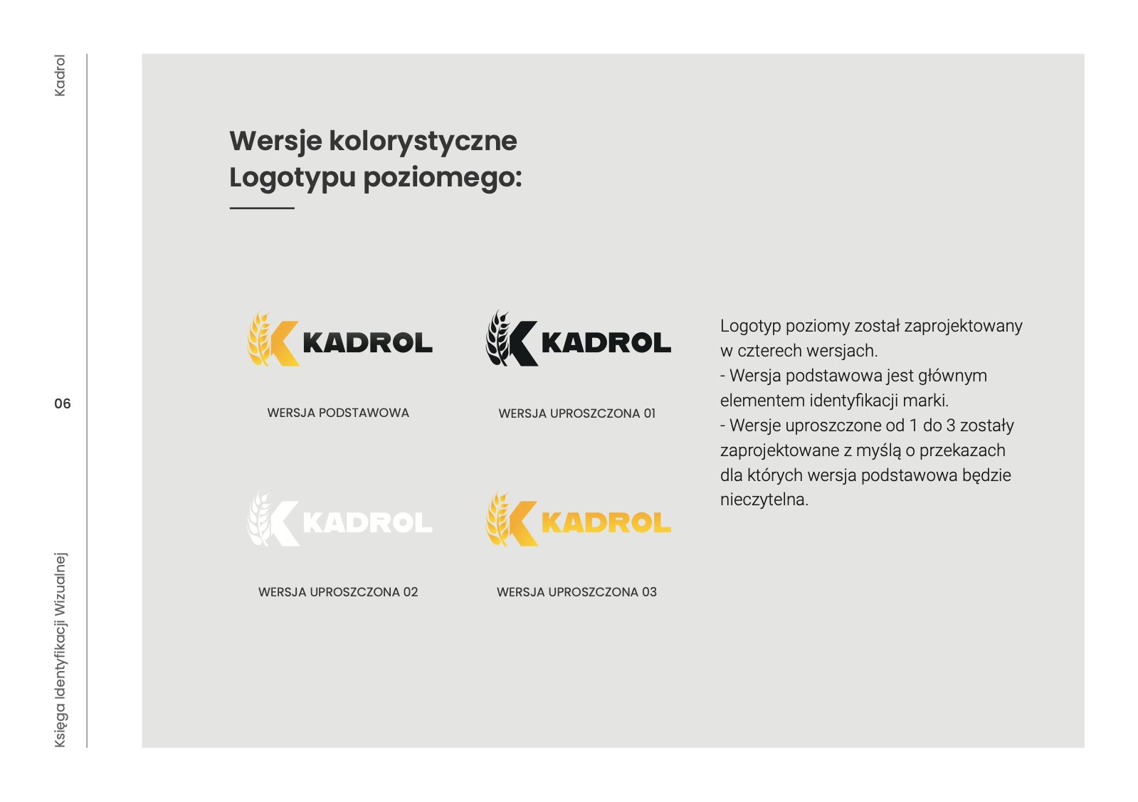
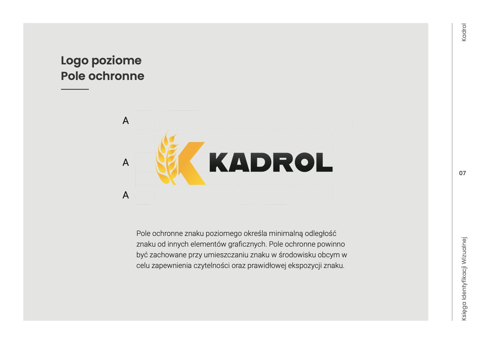
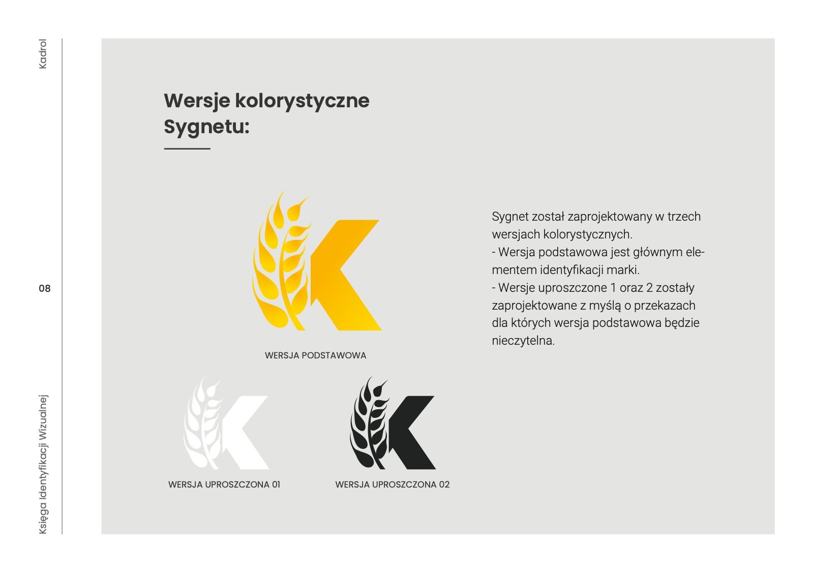
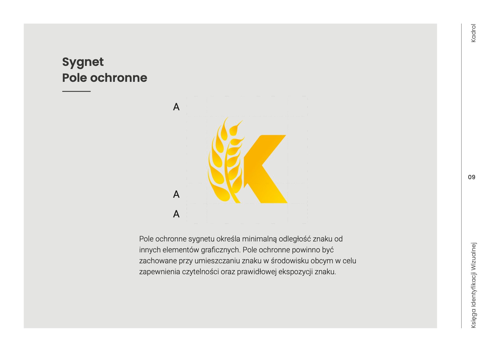
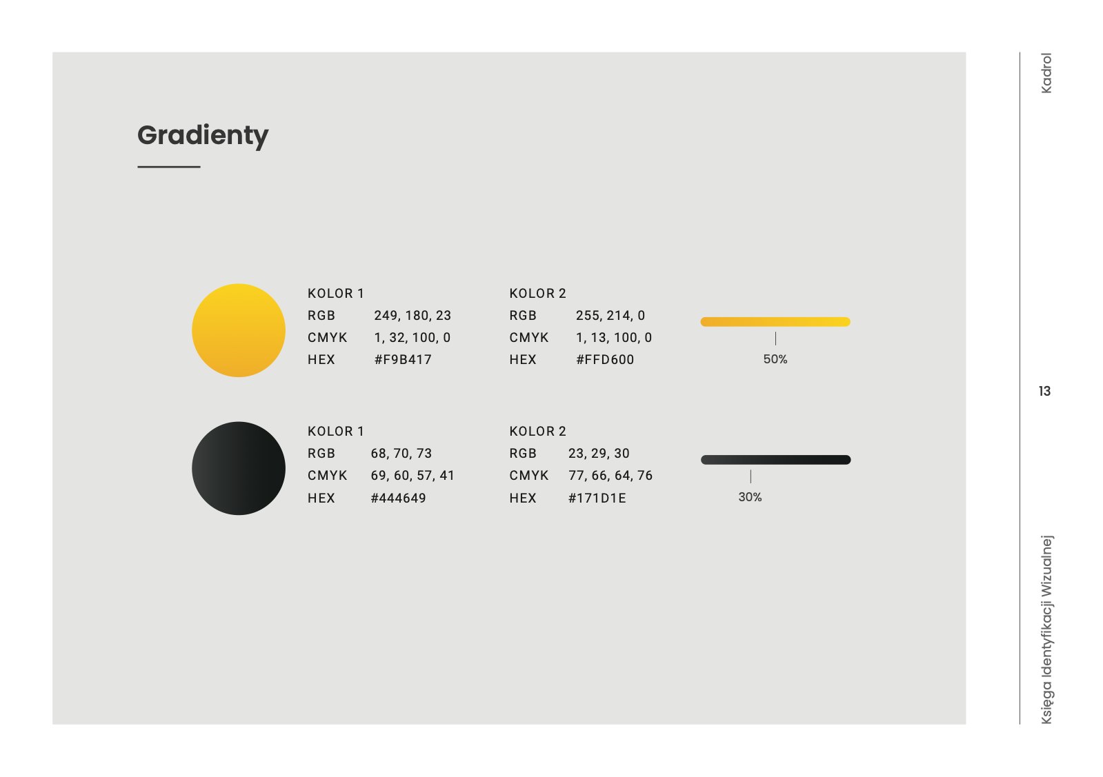
Vertical and horizontal logotype in four versions, symbol, clear space, typography, colours, gradients, business cards, letterhead, bags and flags. 17 pages that look after the K-shaped ear of grain.
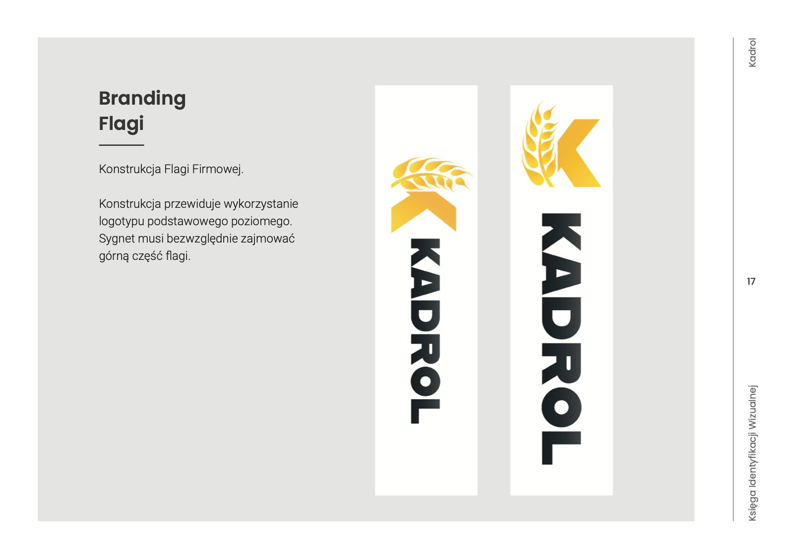
Brand book
and bags
Yellow and graphite gradients, clear space and a paper bag with a big K. A logo that works on a bag, in print and on screen.