

Wielton Group
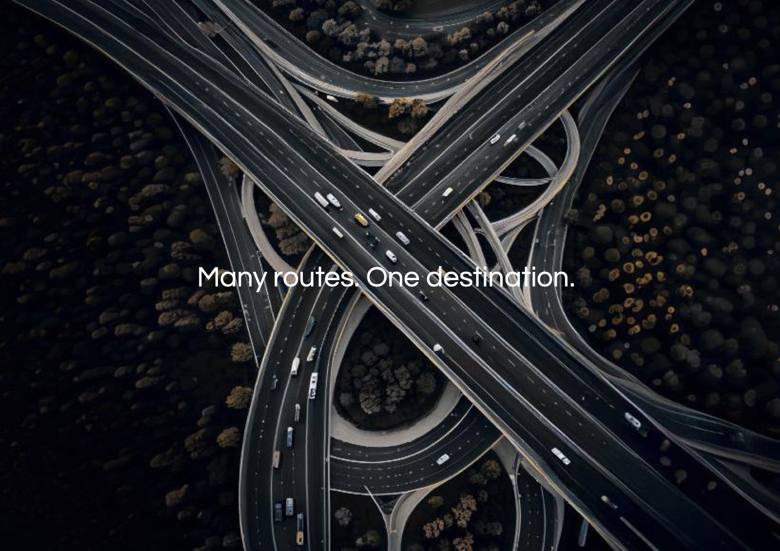
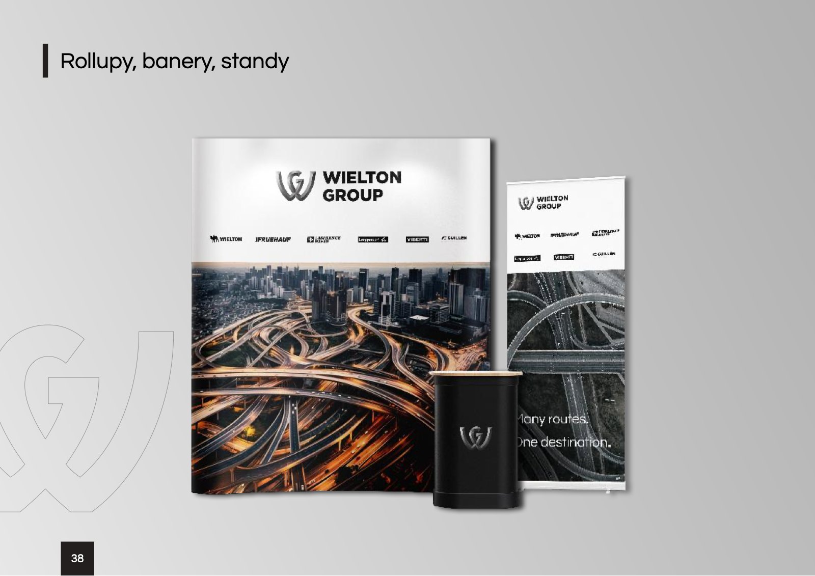
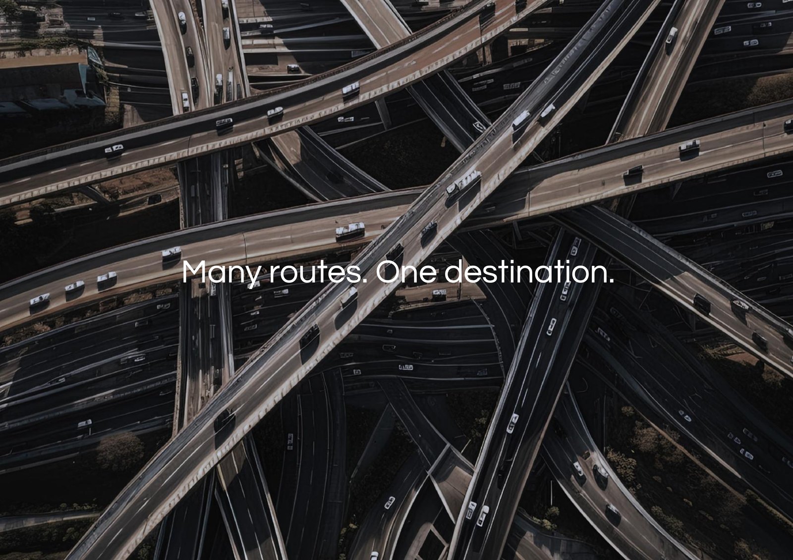
A brand book for a group of seven brands, with the tagline “Many routes. One destination.”
About the project
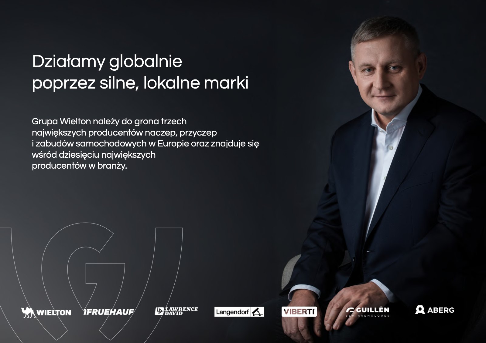
Wielton Group is one of the three largest makers of semi-trailers, trailers and truck bodies in Europe and operates through seven local brands, from Wielton and Langendorf to Aberg. We created its brand book, from the brand story to stationery, branding and social media.
(Challenge)
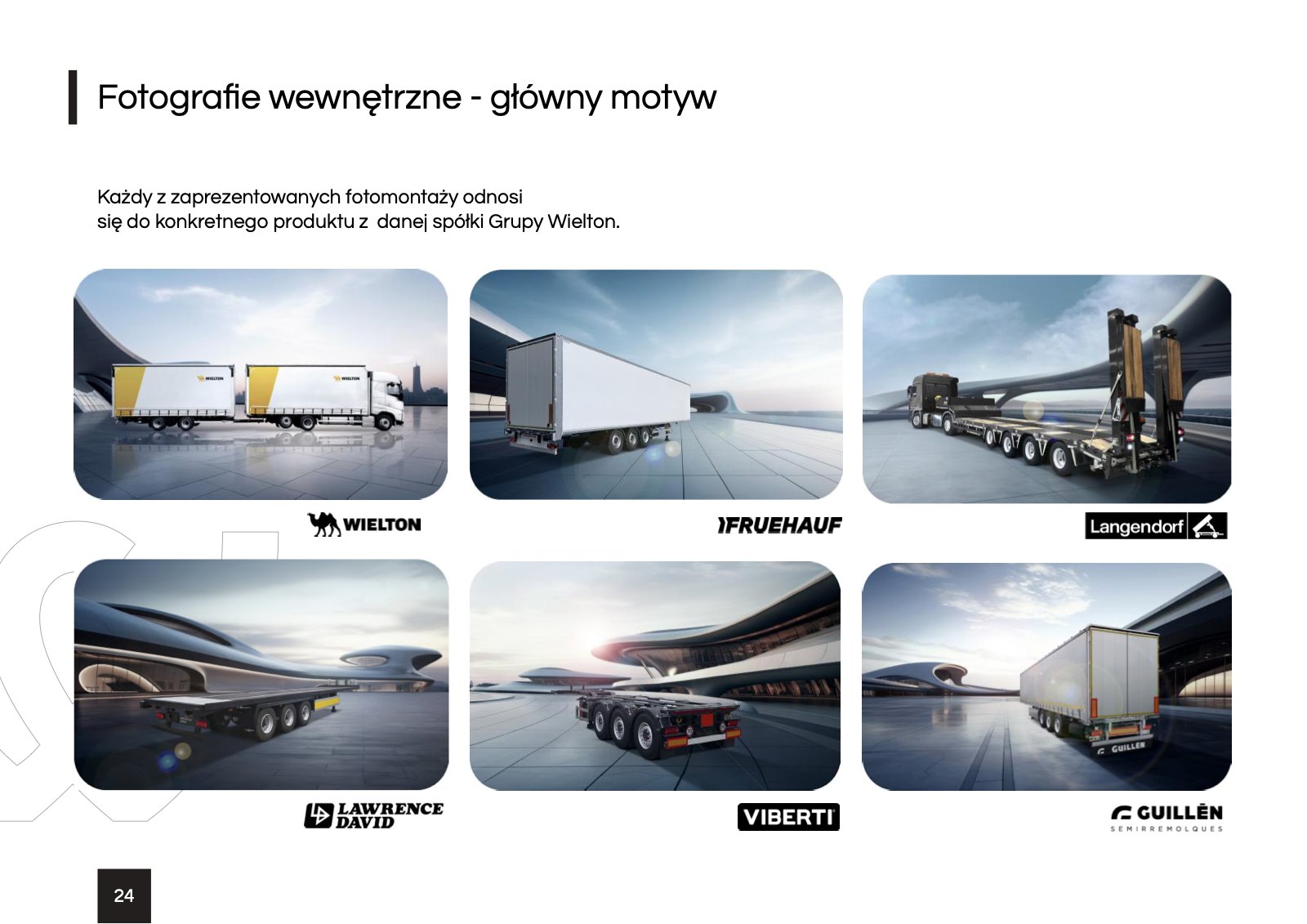
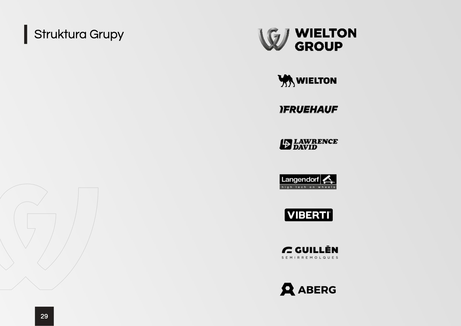
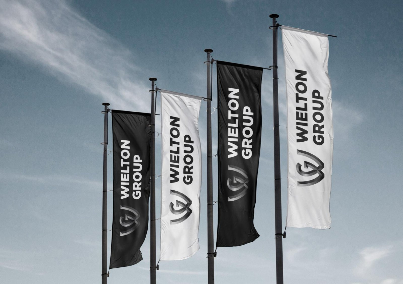
Every company in the group has its own logo, colours and history, from Fruehauf to Guillen. The group identity had to bring them all together without competing with any of them, on letterhead, on the flag outside the factory and on social media.
01 / 03(Scope)
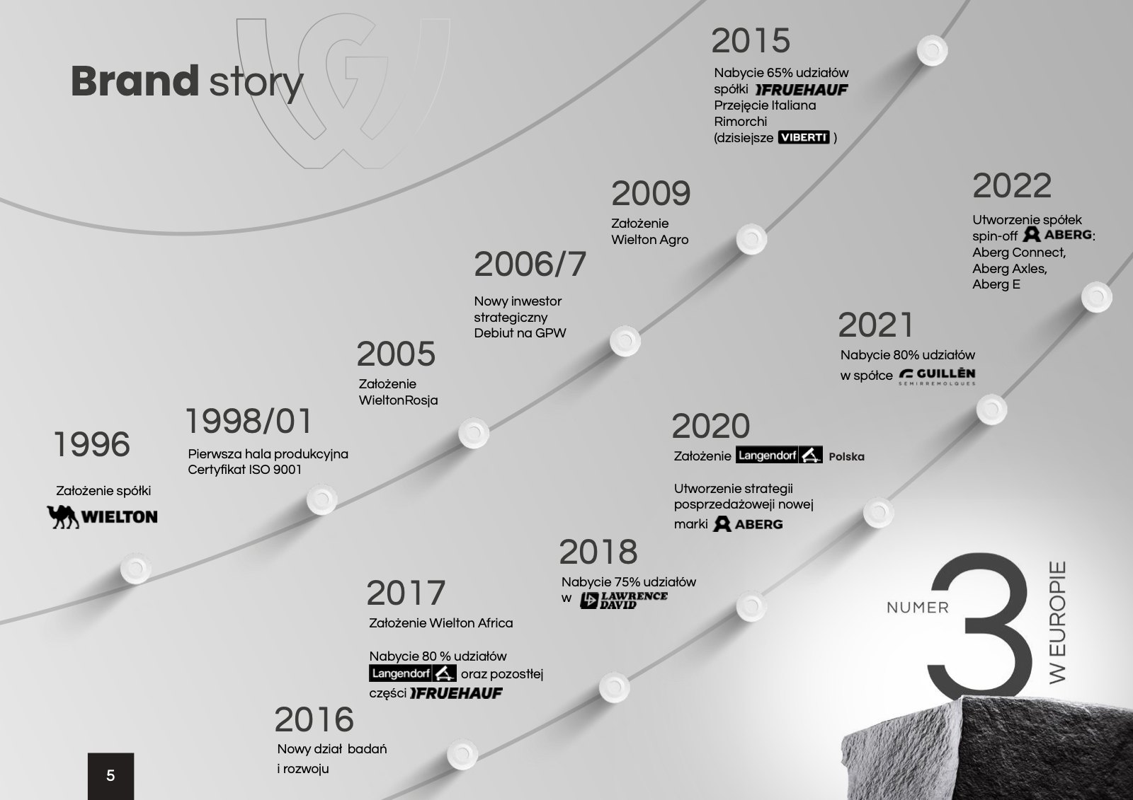
- Brand story, mission, values and the tagline “Many routes. One destination.”
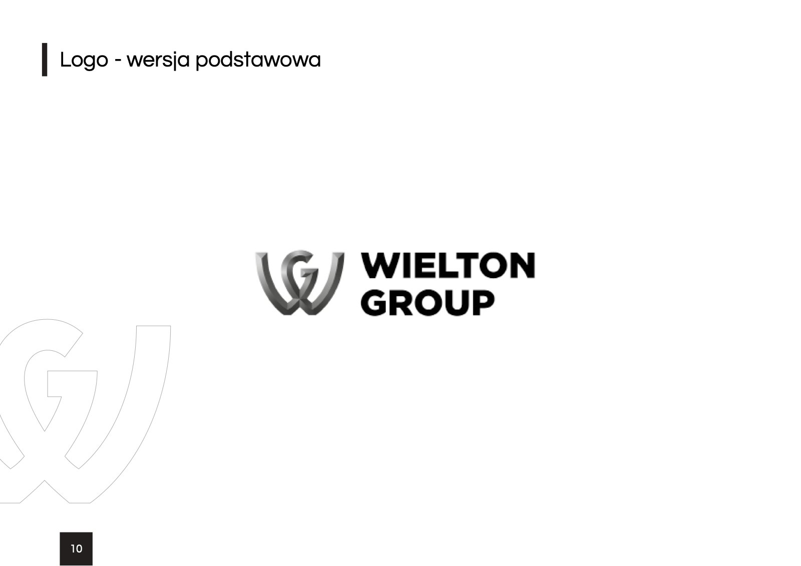
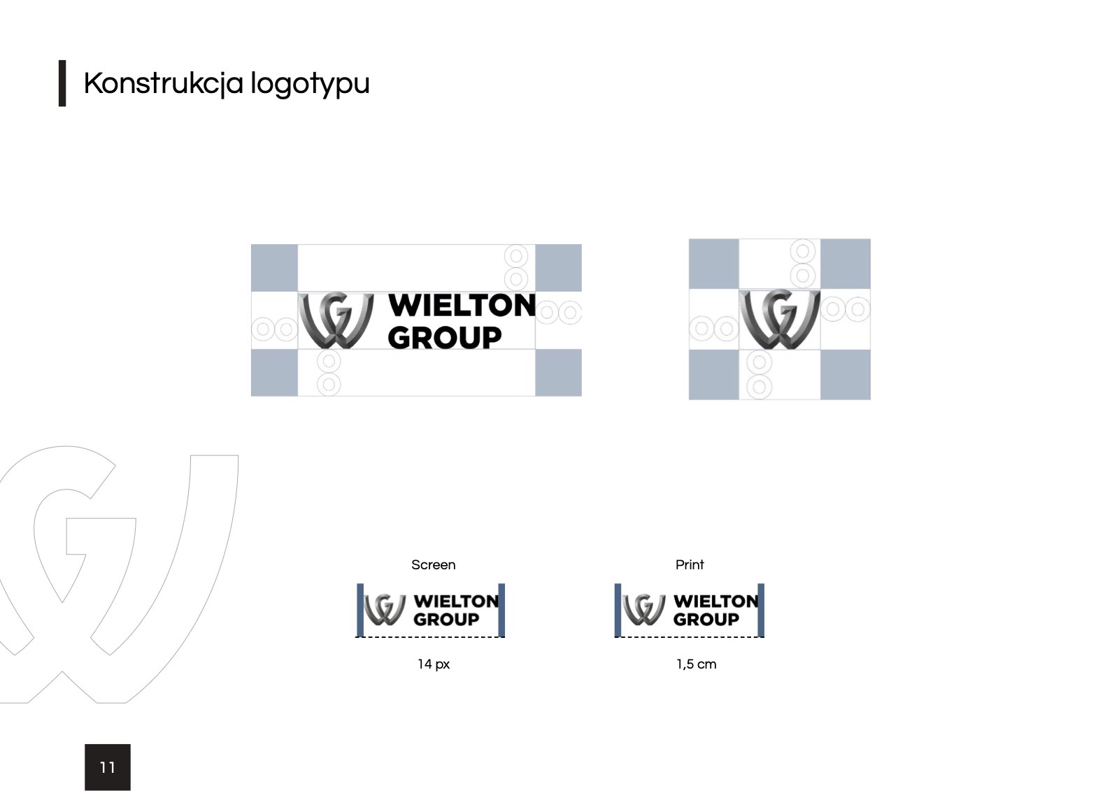
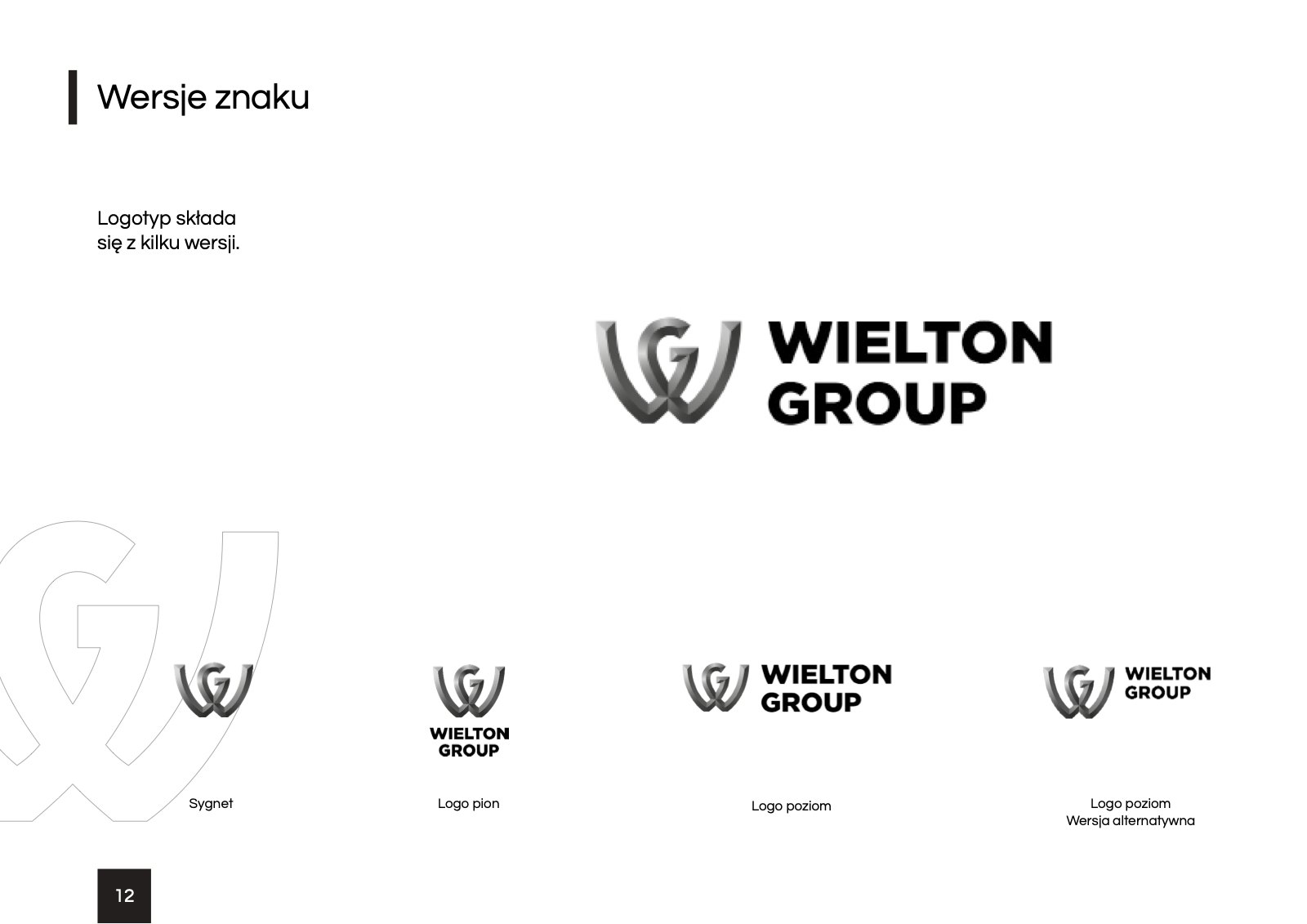
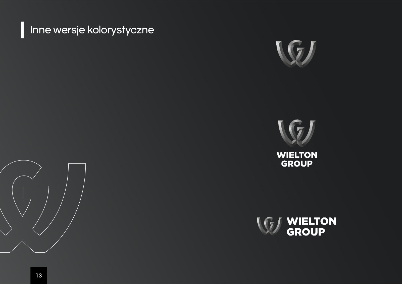
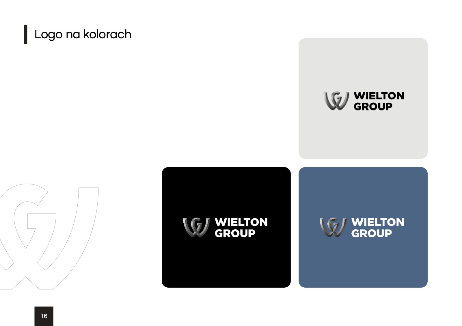
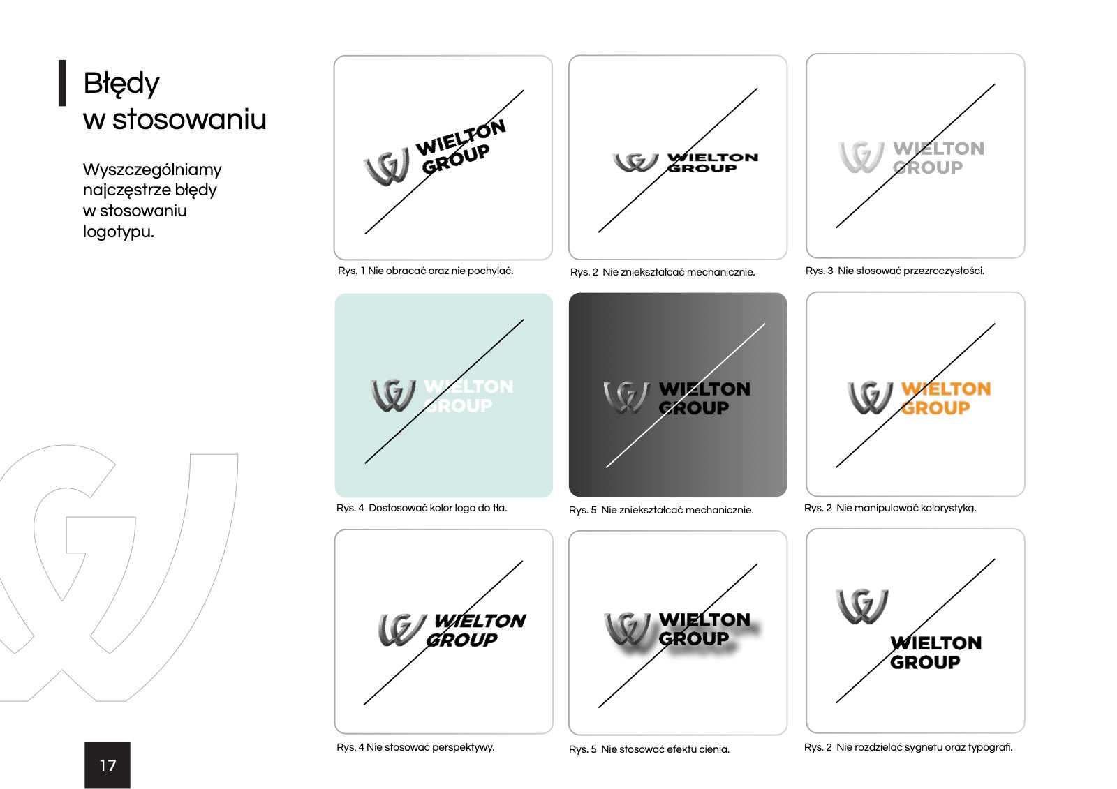
- Logotype usage rules, versions, clear space and the most common mistakes
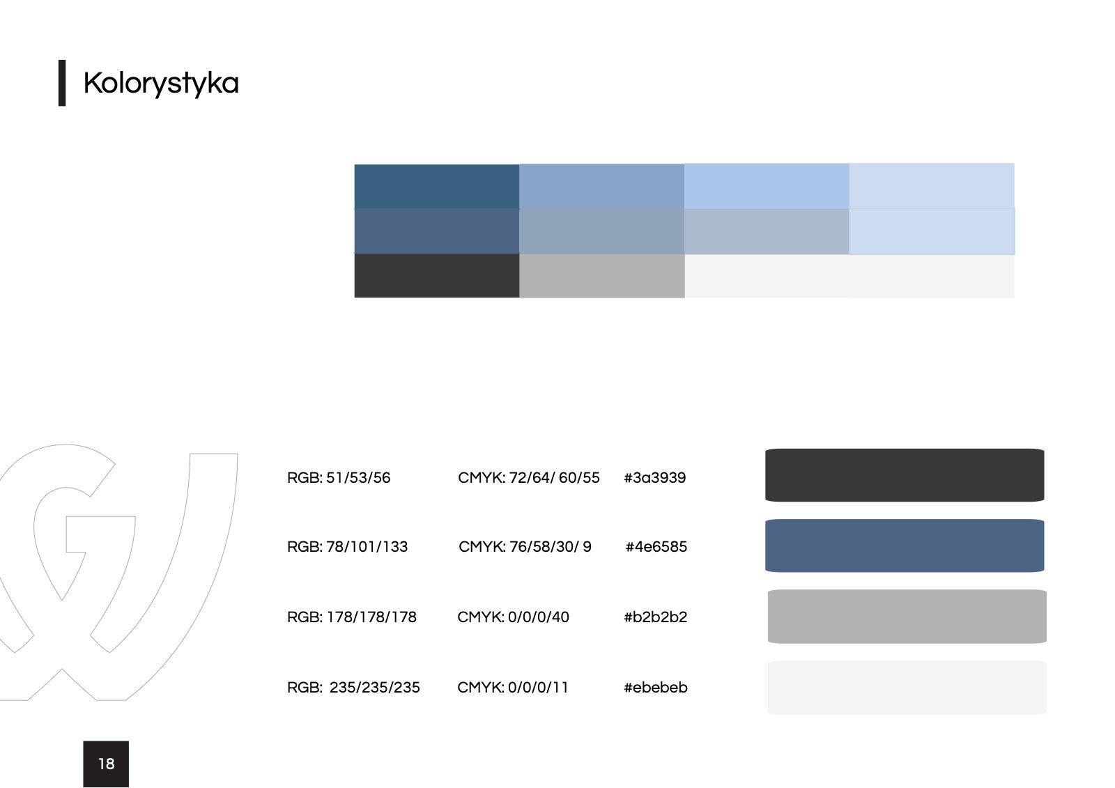
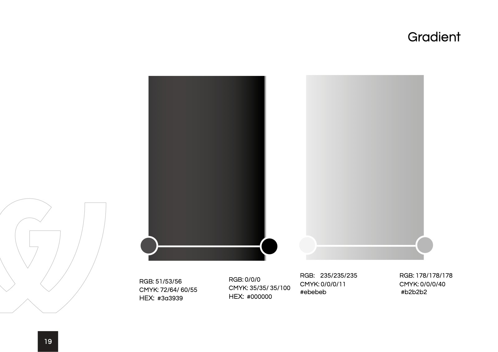
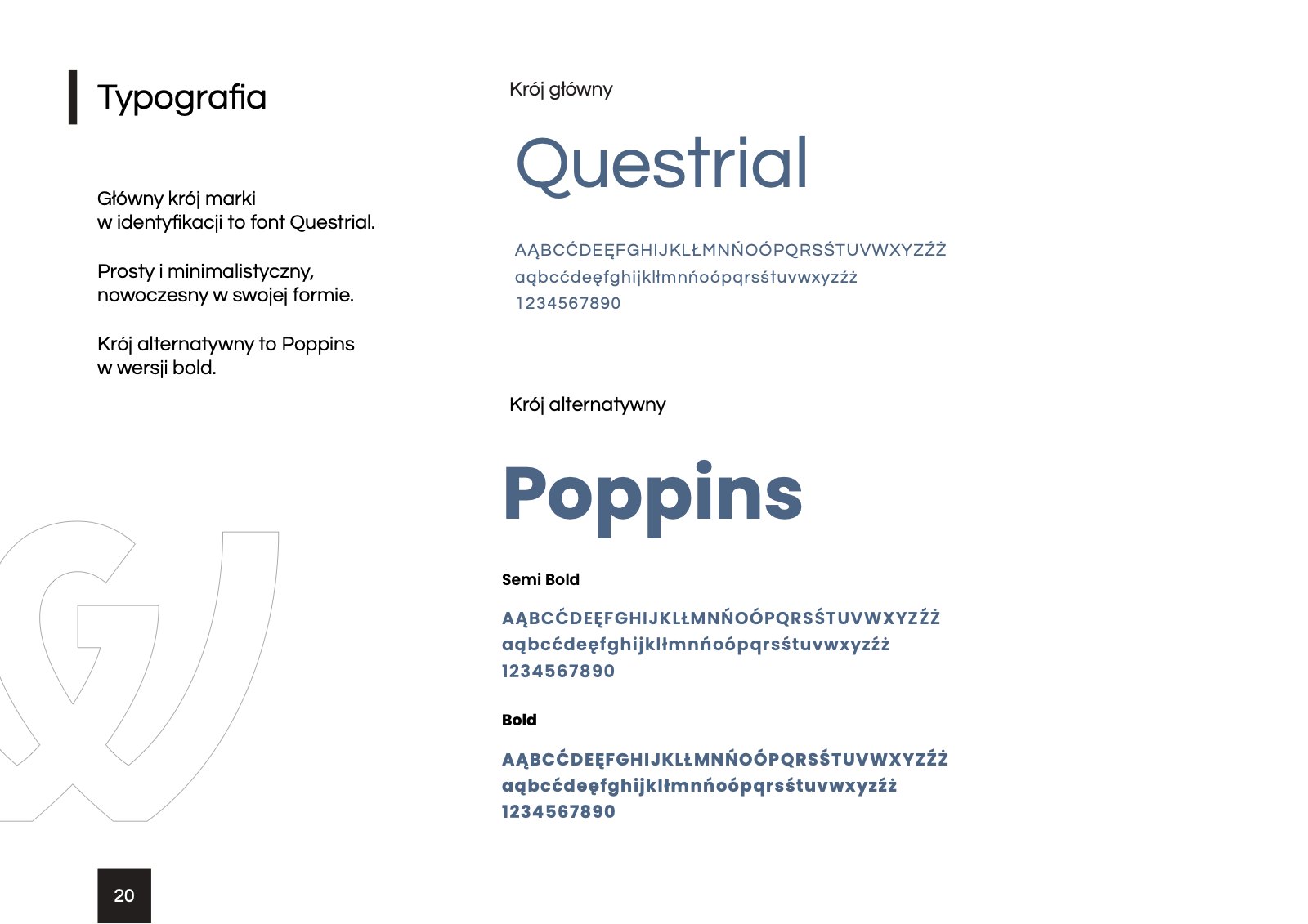
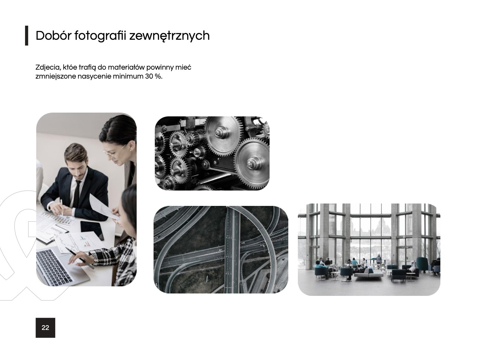
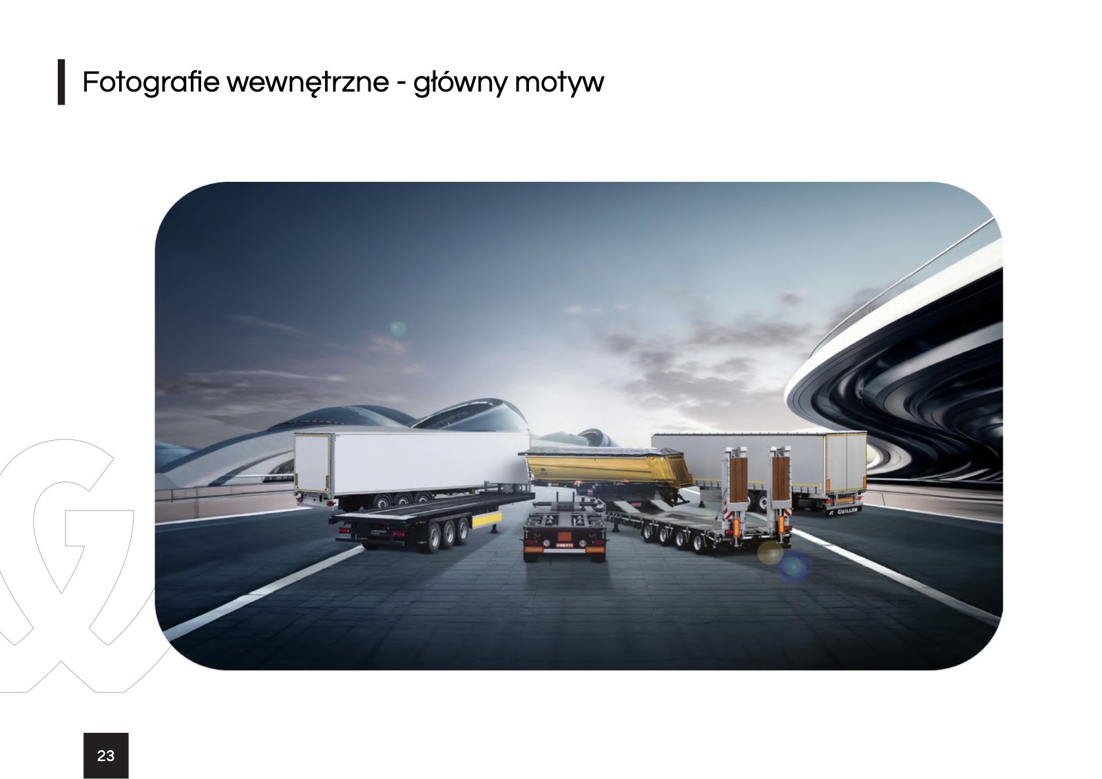
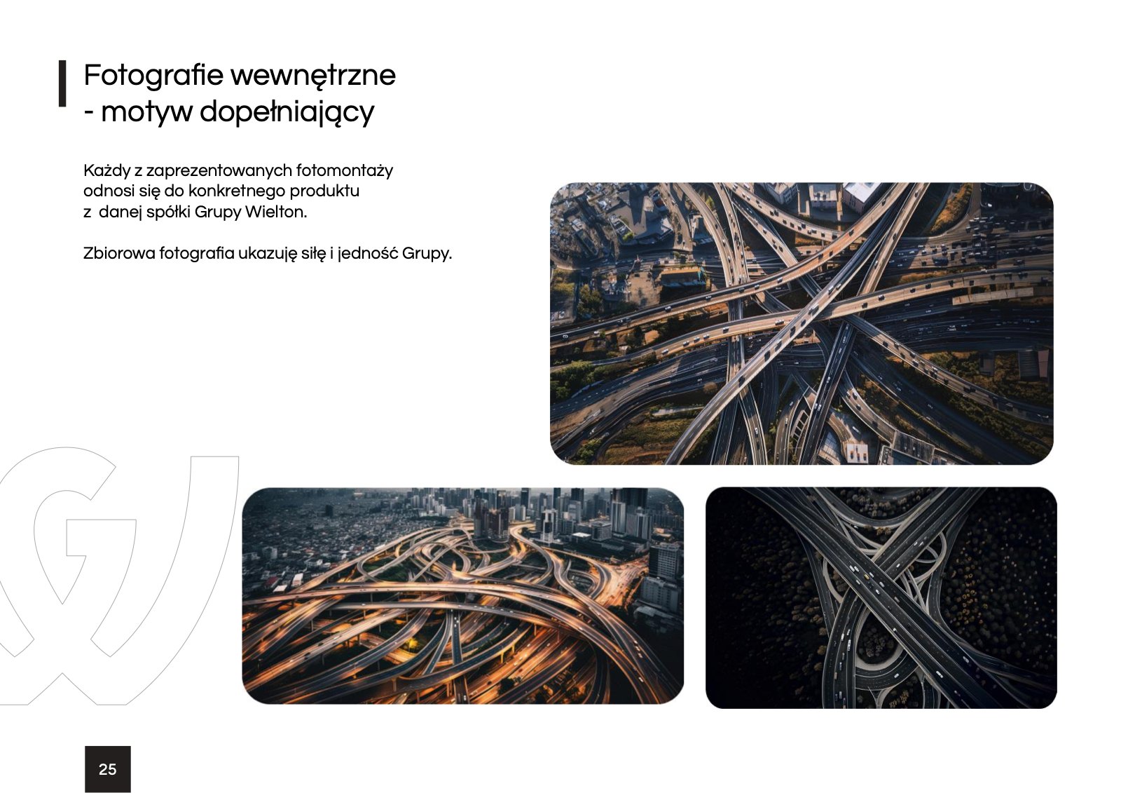
- Colour palette, the Questrial and Poppins typefaces, icons and photo selection
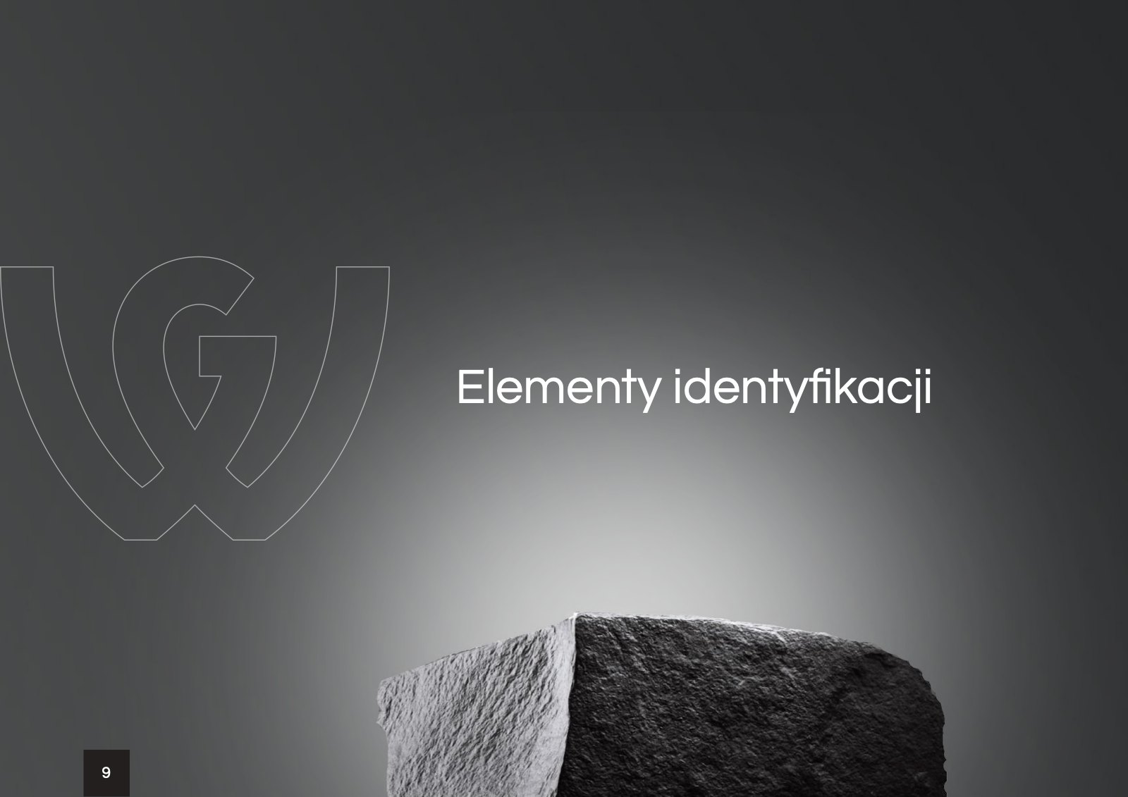
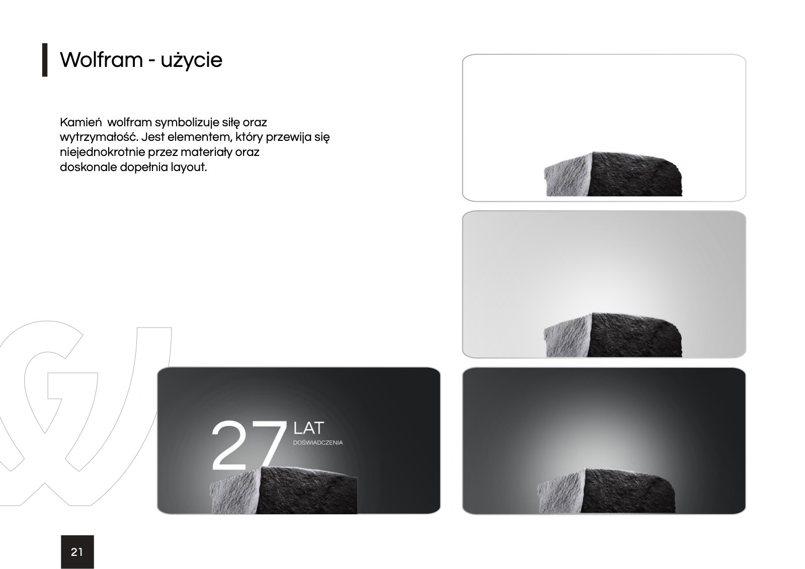
- A wolfram motif, the stone that stands for strength and durability
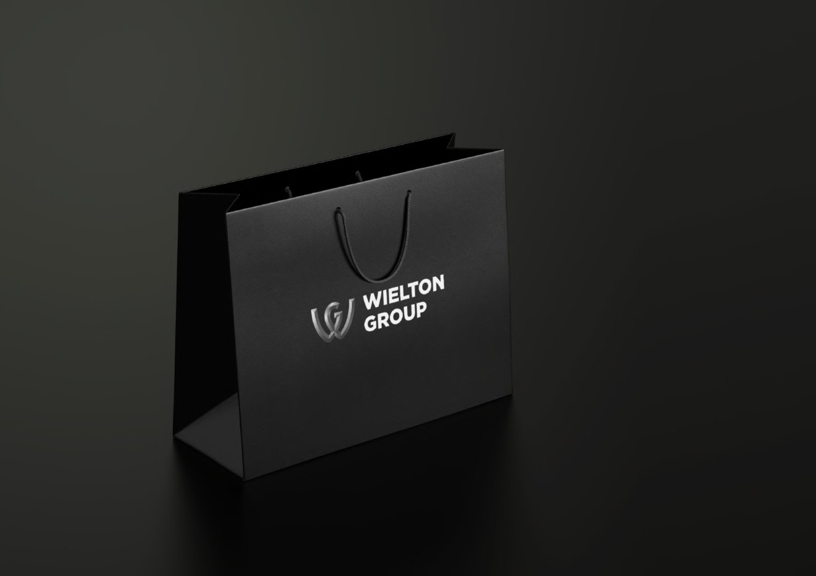
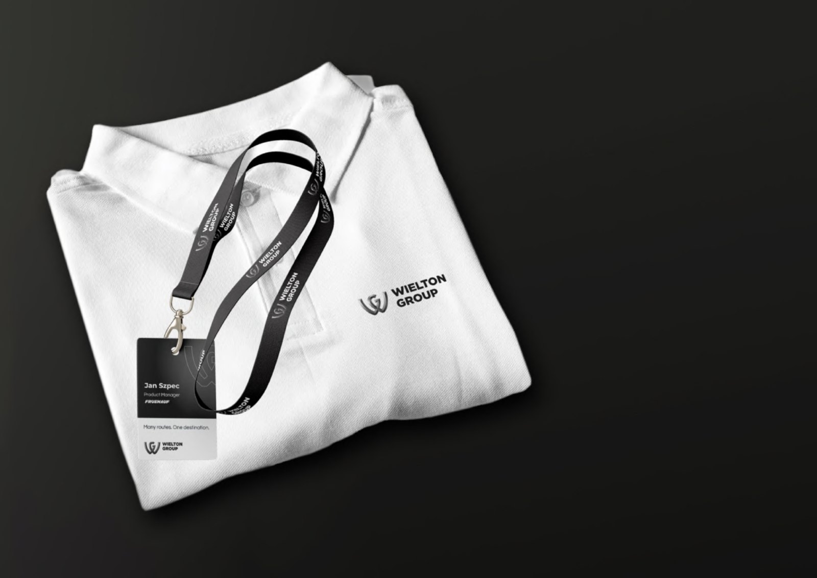
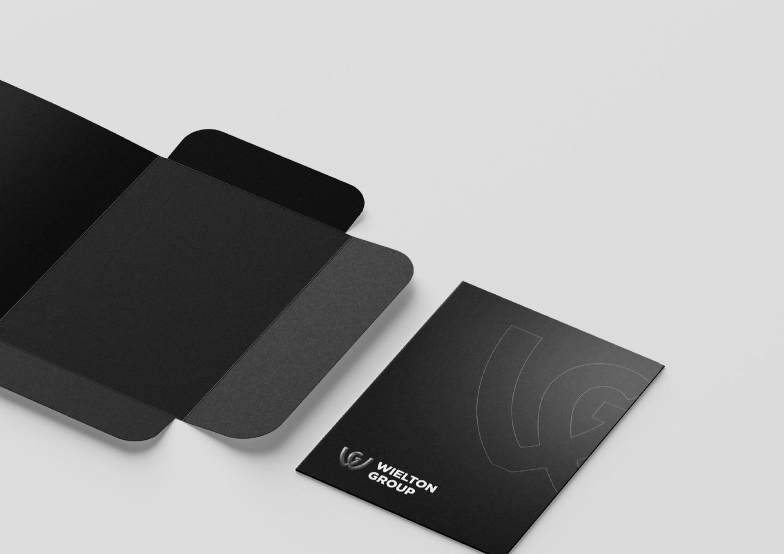
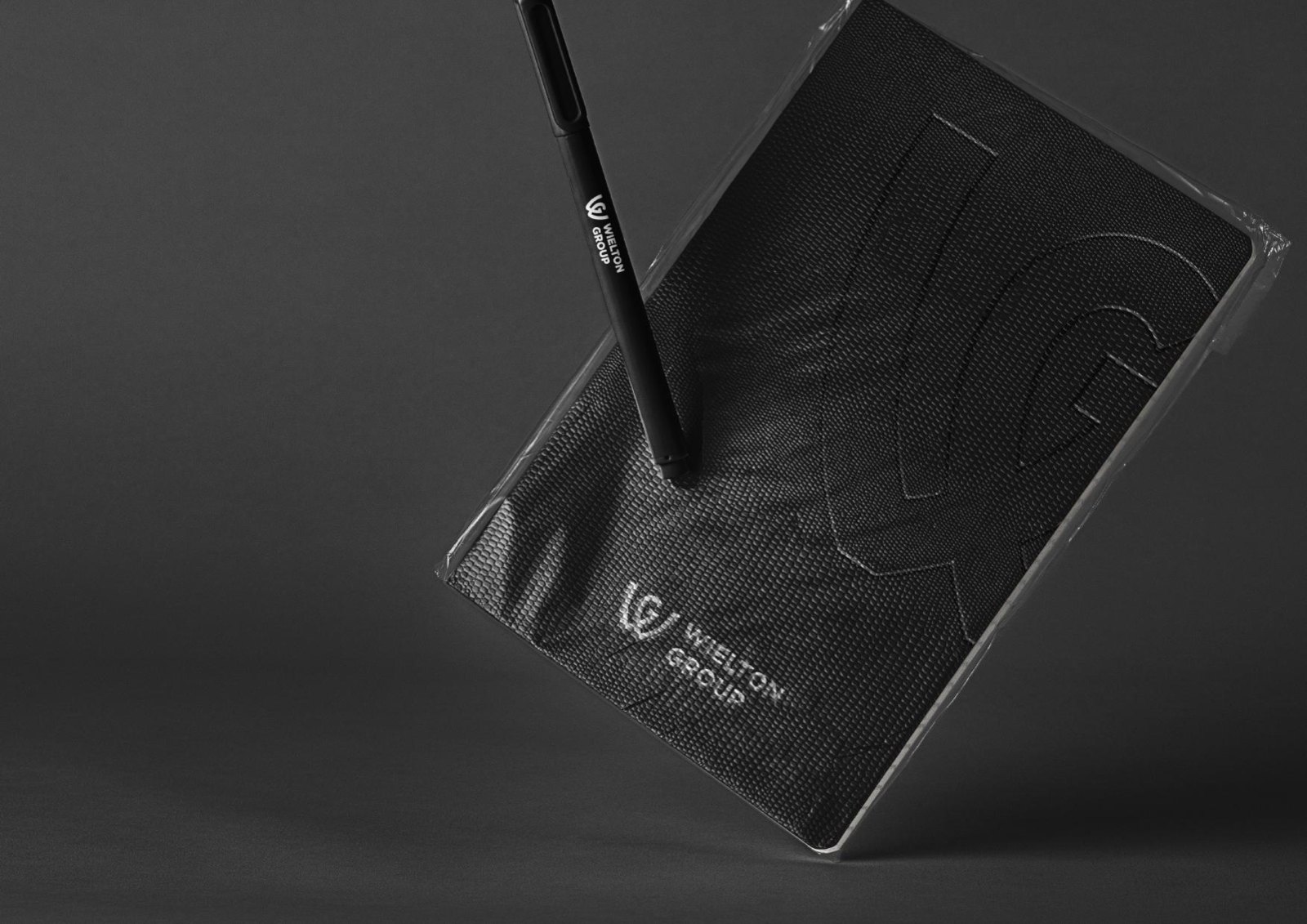
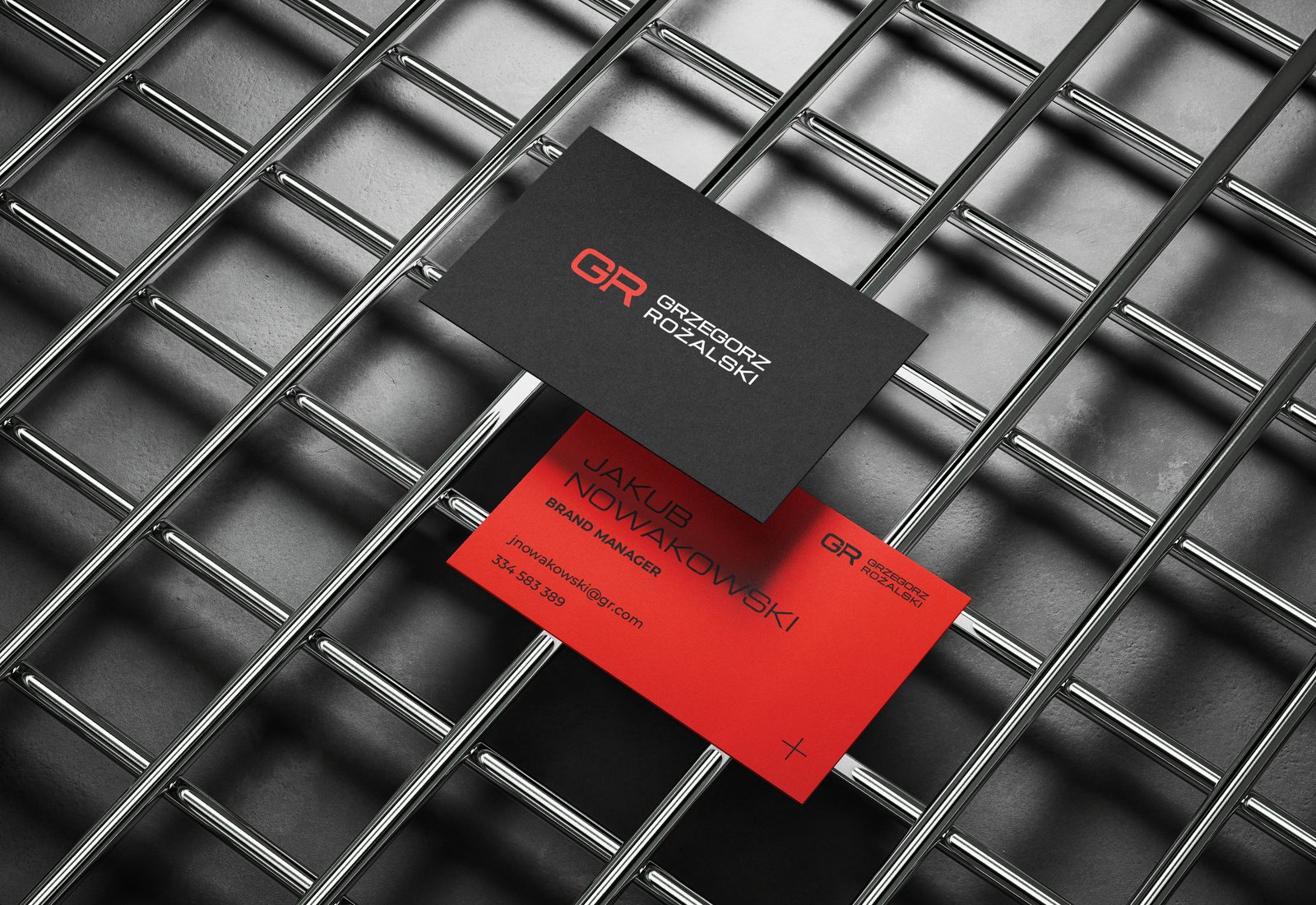
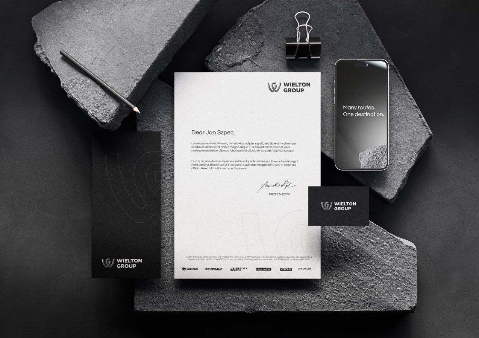
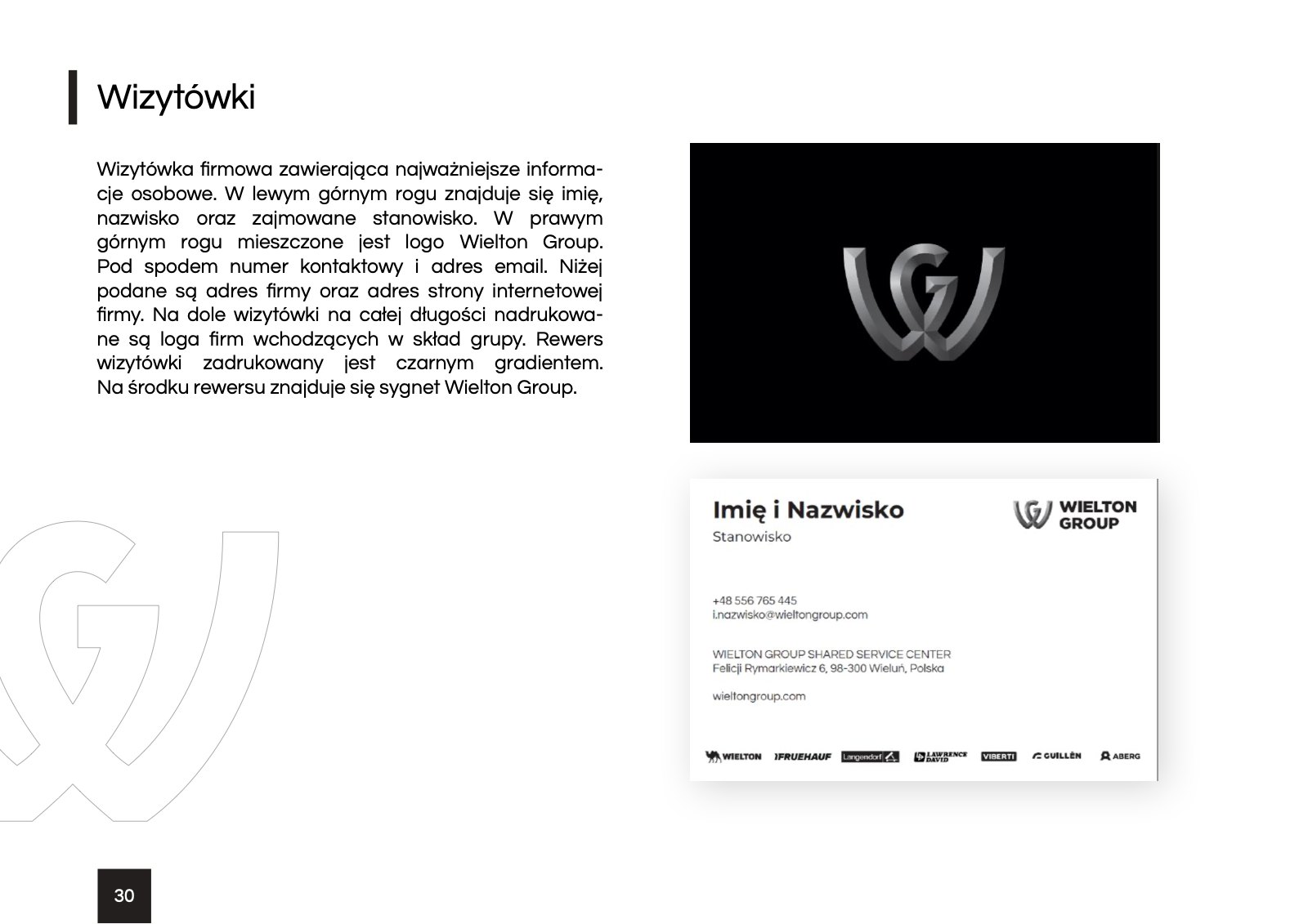
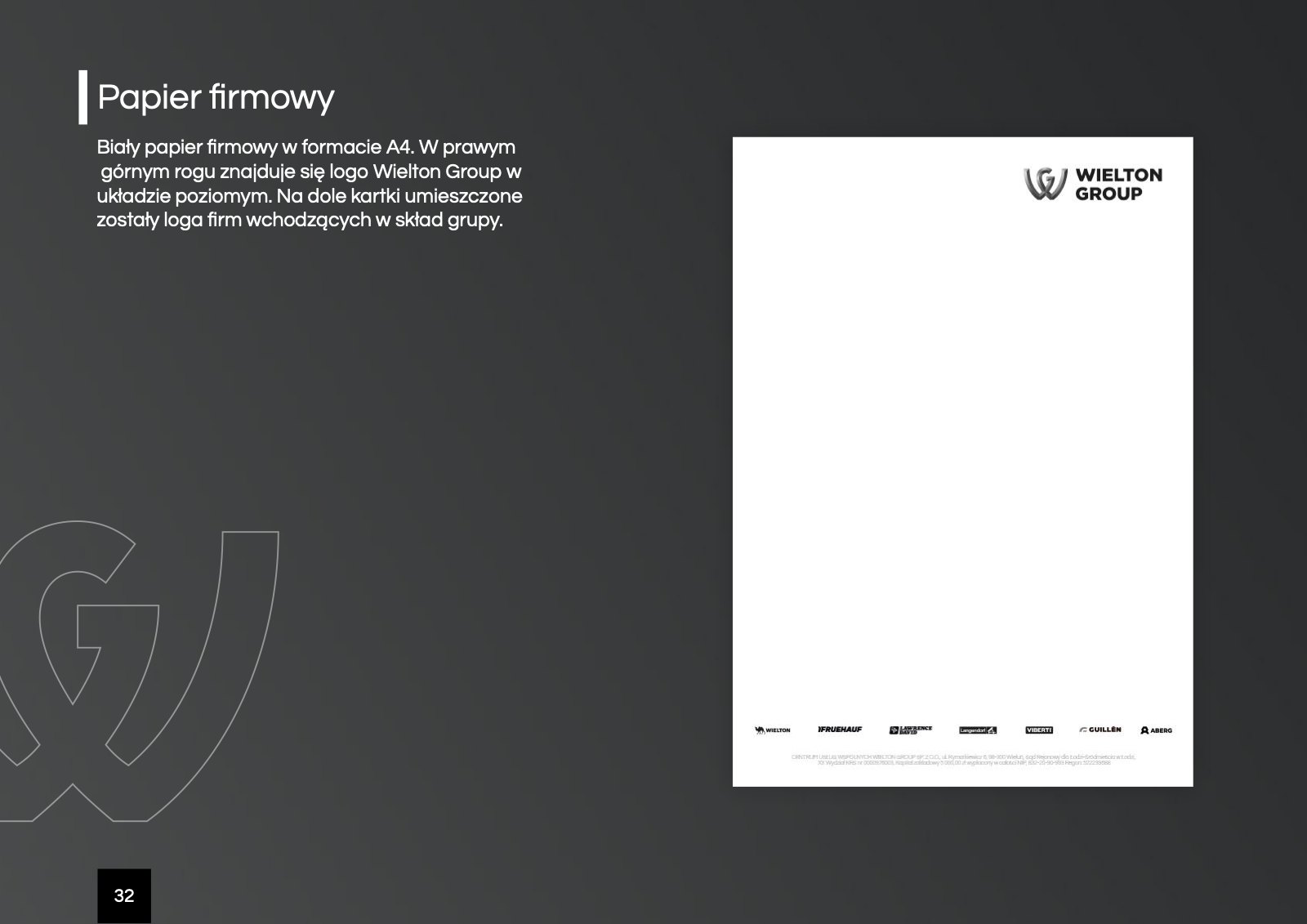
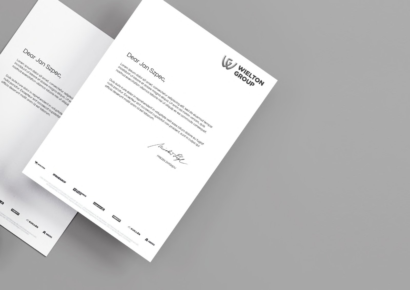
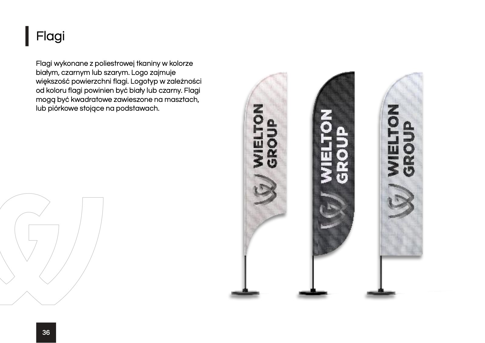
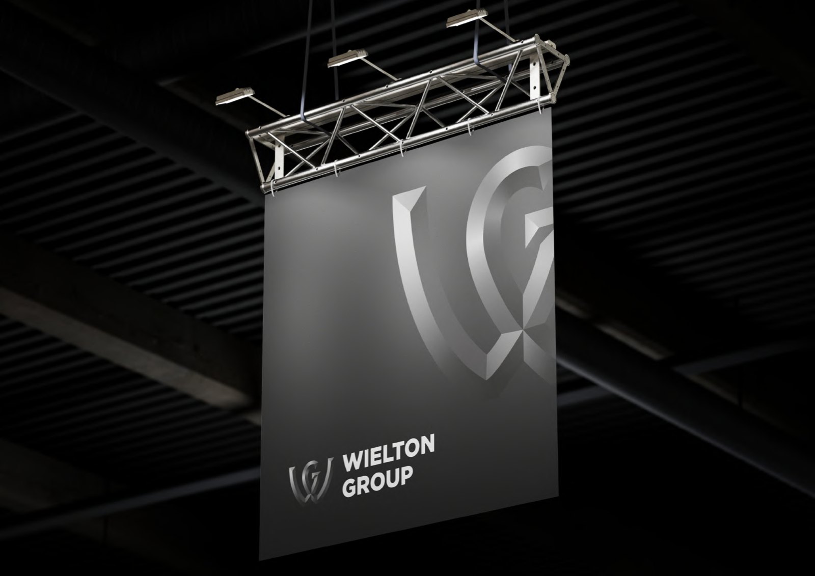
- Stationery, business cards, folders, bags, flags, roll-ups, clothing and promotional items
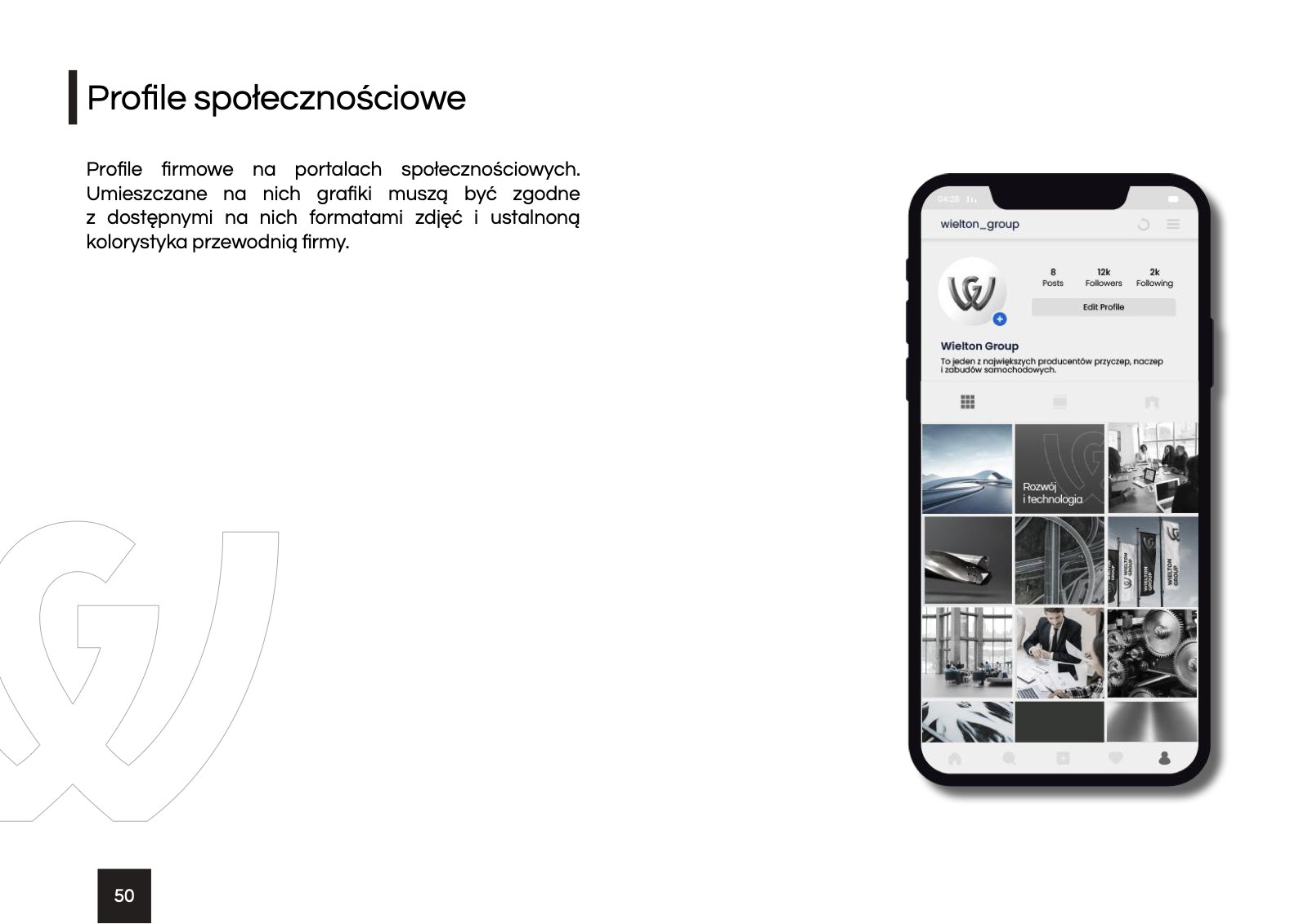
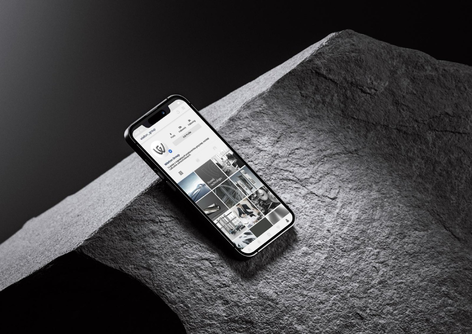
- Social media profiles
(Result)
One 52-page brand book keeps the group identity consistent in every company, from letterhead to the flags outside the factory.
03 / 03brands in the group structure
brand book pages
typefaces, Questrial and Poppins
Brand
book
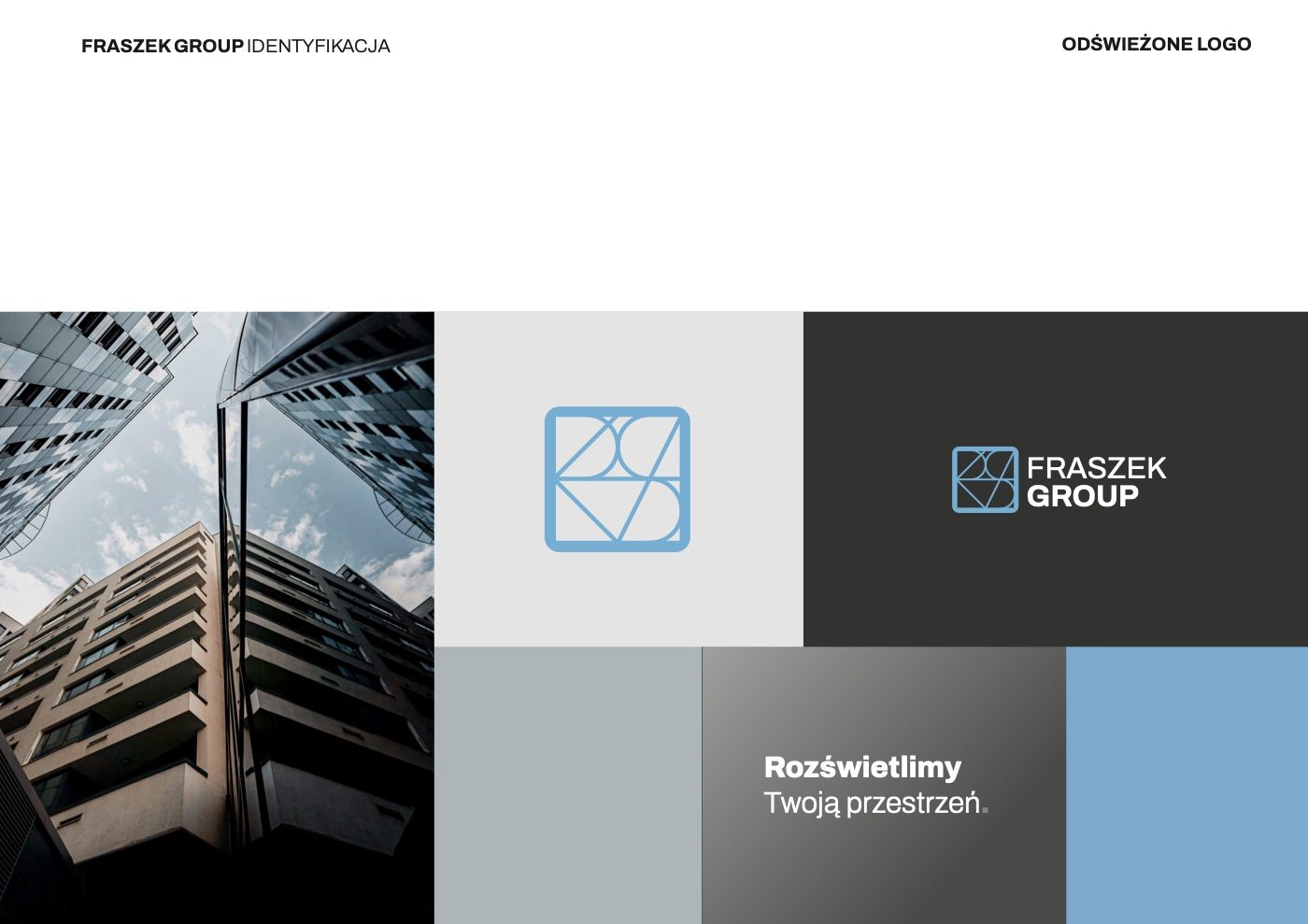
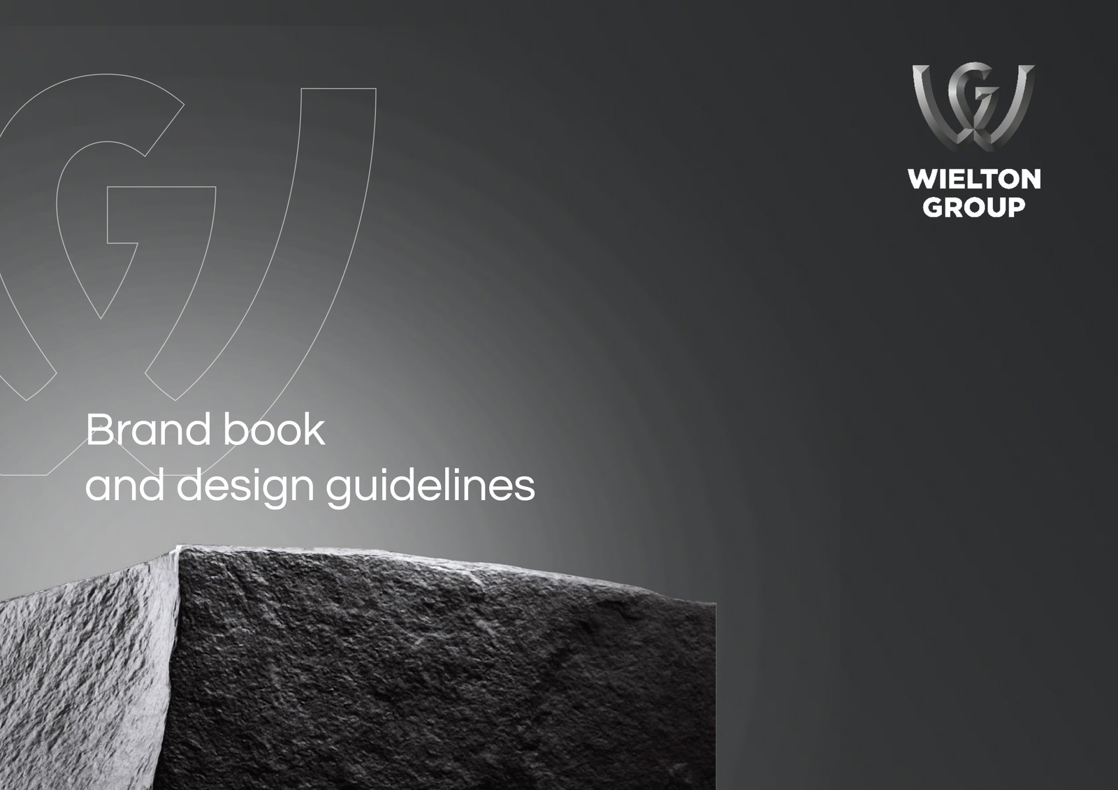
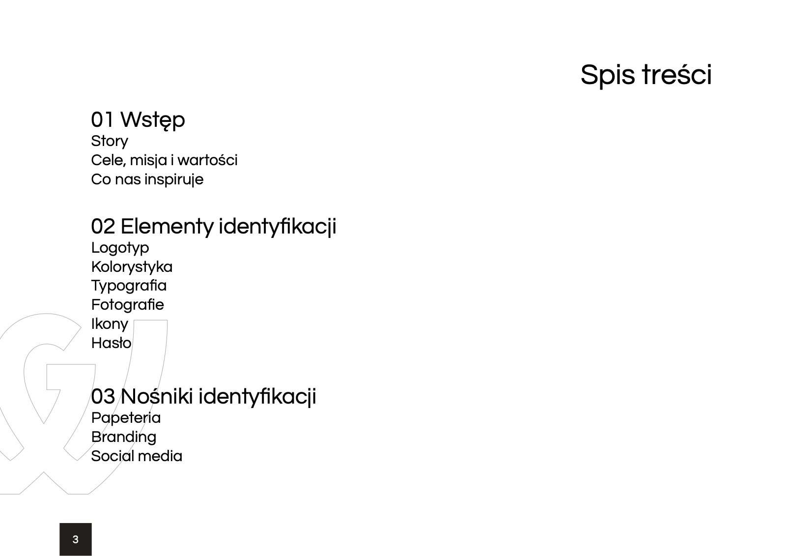
Brand story, logotype, colours, typography, photography, icons and tagline, then stationery, branding and social media. Dark graphite, cool blue and wolfram stone in the background.
Brand
in use
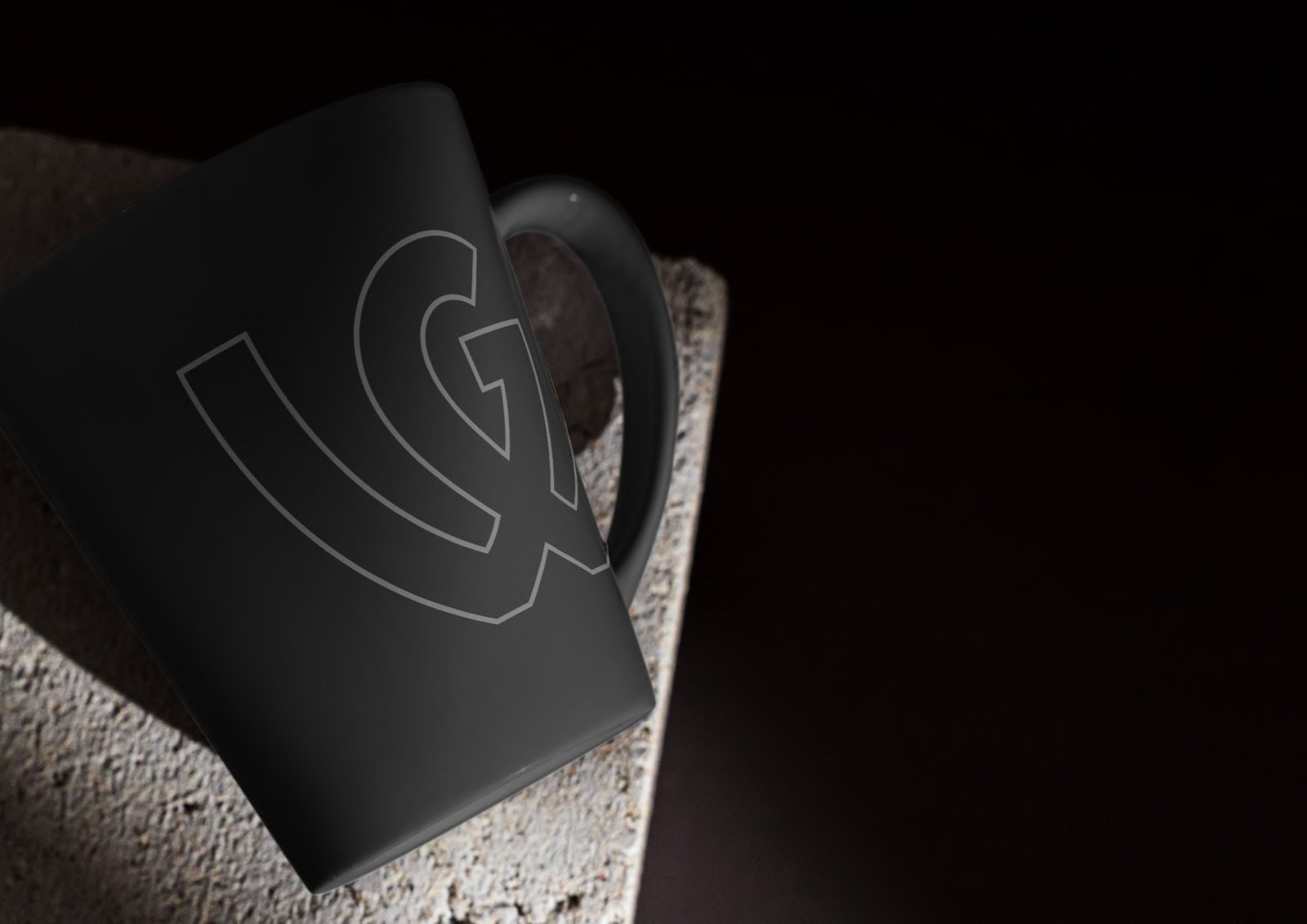
Black, graphite and white, with the W symbol embossed as if in stone. The same mark on paper, bags, flags, clothing and phones.